Oct. 21, 2013
As a part of our regular market analysis we continuously watch the internals to look for structural changes that may provide warning a change may be afoot. Two of the “internals” we follow are the advance decline line and the number of stocks reaching all-time highs. The AD line measures the number of stocks that are advancing (going up) against those that are declining (going down). It makes sense that over time the AD line must either rise or at least stay flat if the stock market (SP500) is going rise. A basket of stocks like the SP500 index can only continue to rise if the majority of the underlying stocks that make up the index are going higher.
In the chart below, the upper pane is the AD line while the lower pane shows the price movement of the SP500 (US Stocks) index over the past 15 years. I have highlighted, in blue, areas where the AD line declined but the SP500 (US stocks) rose. As you know by now, this is called divergence and when divergence raises its ugly head, it warns a change may be ahead. As you can see, we are in a period where divergence has formed --- prices are rising and the AD line declining. So why does this matter and why do I watch this so closely? With further analysis you can see that every time this has occurred in the past, stocks declined. Not immediately but they declined. So this gets the hair on the back of my neck standing up and I need to look deeper for further confirmation. 
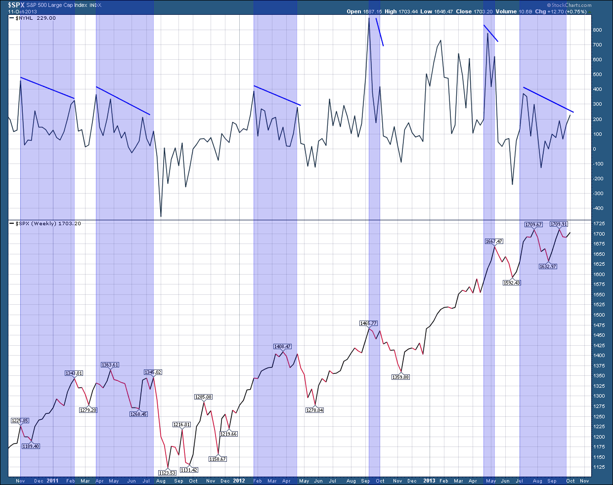
Now let’s go to the second chart which shows the number of stocks that are reaching all-time highs in price (new highs) which are plotted in the upper pane. In the bottom pane I have, once again plotted the SP500 index price as my proxy for the US stock market. This is not too different from the first chart because over time the “new highs” line must either rise or at least stay flat if the stock market is going rise. The stock market index can’t continue to rise over time if the number of “new highs” decline. Higher prices in the individual stocks are required for the index to make higher prices. As with the first chart I have highlighted, in blue, areas where the “new highs” line declines but the SP500 (US stocks) rise. As with the first chart, you can see it does a very good job at giving advance warning that a correction could be near.
 While these “internals” are not perfect at predicting the future, they are very good at giving us an advance warning of potential struggles ahead. Unfortunately, while they do raise a warning flag they don’t give insight as to when it will occur or how big a correction to expect. In as much as we already experienced a mild correction over the prior 2 weeks to the debt ceiling debate, the question that comes to mind is it whether that correction is the extent of it or do we have more to come? While I have been burned before in being too bearish on my concerns of a top, I am cautiously optimistic we are near an end of this correction and the two cyclical, seasonal bullish trends will provide the support the market needs to move ahead through the balance of the year and pushing the potential for a much greater decline into the first half of next year.