Investments

Jan. 20, 2014

Obviously this post is meant tongue-in-cheek but there actually are those that watch (and invest accordingly) these things … The Super Bowl Indicator holds that any NFC team winning the Super Bowl is bullish for stocks. It’s worked 80% of the time since the Super Bowl began in 1967.  But if you take a close look at the S.B.I.’s performance, you’ll see the stock market LOVES the 49ers. In fact, win or lose, San Francisco has been in the Super Bowl in four of the five best years for the stock market since the big game between the NFC and AFC champs began in 1967. The Niners’ Super Bowl wins in 1985, 1989 and 1995 were followed by annual gains of 27.7%, 27.0% and 33.5%, respectively, for the Dow industrials. From 1967 to last year, only the Pittsburgh Steelers’ victory in 1975 delivered a bigger advance.

Even in 2013, when San Francisco lost to the Baltimore Ravens, the market boomed.

So S.B.I. believers don’t want just any old NFC team to triumph over the AFC champion in the Super Bowl. Under this thinking, it’s best for your portfolio to have the 49ers beat the Seattle Seahawks in Sunday’s NFC championship — and then win the big game itself on Feb. 2. Of course, the Super Bowl Indicator is a classic example of confusing correlation with cause and effect. MarketWatch’s Mark Hulbert took the whole faulty concept to the woodshed in a column last year. As he blasted “spurious correlations,” Hulbert pointed out that Bangladeshi butter production is an even better “indicator” for stocks. Perhaps the S.B.I. should be renamed the B.S.I.

Of the nine years when the  S.B.I. has failed, four involved Super Bowl appearances by the Denver Broncos — who play the New England Patriots on Sunday in the AFC Championship. So you may want to be wary of the Broncos — and also the Patriots. The best performance in years when the Pats won it all was a 3.1% gain in 2004. The worst was a 16.8% drop in 2002. And the Patriots’ loss in 2008 to the New York Giants was followed by Wall Street’s worst year since the Super Bowl began, a 33.8% slide in the Dow.

Seattle’s only Super Bowl appearance in 2006 was a loss to the Pittsburgh Steelers.  The Dow surged that year.  (Although the Seahawks are in the NFC, the Steelers have their roots in the old NFL, and for the purposes of the indicator are deemed to be an NFC team, meaning the indicator is deemed to have held that year.)

Overall, the prediction business is tough. Just ask all those Wall Street strategists who bet that the falling hemlines in last year’s spring collection indicated a bad year for stocks.

Jan. 13, 2014

Last week I posted what Cullen Roche of Pragmatic Capitalism thought was the major risk for 2014. In today’s post I want to list one of the two major risks (excluding any exogenous shock) I see to the investment markets for this year. Because all markets are interlinked and the bond market is so big, it’s easy to think of bonds as the dog and stocks as the dog’s tail. As such, anyone holding equity investments needs to keep a very close eye on the bond market.

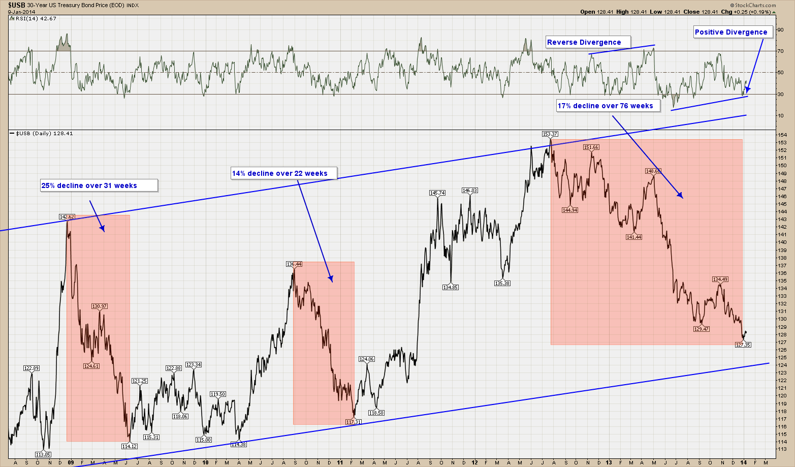
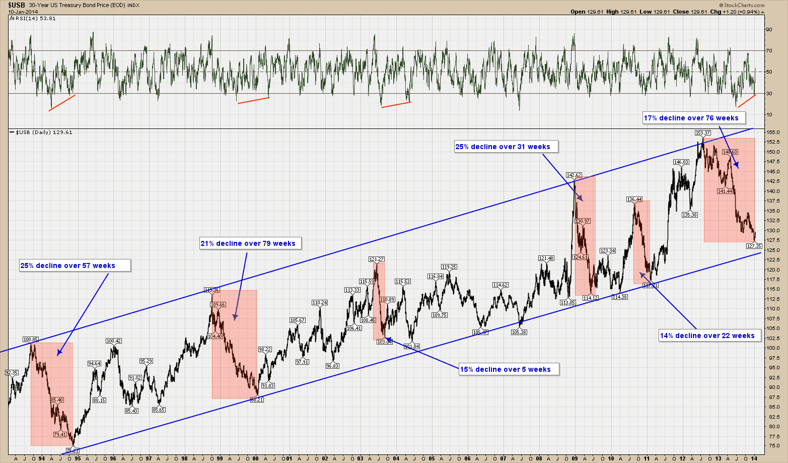
Below is a 20 year view of the 30-year US Treasury bond.  As you can see it has been in a very well defined upward (bull market) channel.  Like all investments it moves up and down but during this entire period it has respected its channel boundaries.  In the highlighted areas I have noted major price swings down (corrections) and the time it took to complete each.

An interesting aside is that an astute investor could have purchased the long bond as it neared the bottom of the channel and sold as it approached the top and been handsomely rewarded over the past 20 years with very low risk investment strategy that would have outperformed just buying and holding.

The chart below is the exact same chart as the one above except I am only showing the last 5 years’ worth of data rather than 20. As you can seek the current correction we are in has been going on for well over a year now and if history holds, either has already or is close to completion as it nears the bottom of the channel.  While I continue to stress no one can predict the future, the chart is telling me the decline is very close to being done as positive divergence has formed on our momentum indicators.  This is a heads up that momentum has changed course (up) and price should be not too far behind. While timing is never exact, if we were to fall further one could imagine a decline to the exact bottom of the channel, which is less than 3% away from where we are.

So you are probably wondering what and how this all ties back to the topic of this post, risk to the markets.  At some point the FED will either loosen their reign on interest rates (think taper) or the market will demand higher rates.  If rates rise and go high enough, history says stocks will suffer.  The reason for that is if investors have a much lower risk alternative providing a similar return, they tend to take the path of lowest risk.  If this happens, the nice, well-formed and respected price channel of the past will be breached to the downside.

Nothing lasts forever, so for now and until price tells us otherwise, the channel is still in control but watch out if/when it is violated.

Jan. 6, 2014

Happy New Year everyone. Cullen Roche of Pragmatic Capitalism wrote a thought provoking post regarding investors Biggest Risk in 2014. He writes …

The biggest risk in 2014 is likely to be a common one – recency bias.  Otherwise known as your own brain’s tendency to focus excessively on things that have only just occurred.  Of course, the markets don’t really care much for what’s just occurred.  Most market participants are trying to make decisions based on what they think will occur in the future.  Unfortunately, they often come to these conclusions based on extrapolating the recent past into the future.   This is one of the broader causes of the herd effect and groupthink.  It also contributes to market bubbles.

After a year like 2013 where many markets felt like a “can’t lose” proposition the tendency will be for many people to extrapolate the recent past into the future.  They’ll deviate from their plans, reallocate a bit more aggressively or less aggressively and begin to fall in-line with the herd.  But this is generally a bad idea.  Letting the recent market action excessively influence your long-term plan is what I refer to as part of the multi-temporal problem in portfolio construction.  And when you let your process become dictated by your emotions you generally lose control of your process and your portfolio plan begins to come unraveled.

So beware the recency bias in 2014.

--------------------------------------------

He brings up a really important issue that all investors face. I would add this bias is alive and well not only this year but all other years for that matter (remember back what you were thinking what would happen in the markets after the 2008 crash).  So while ridding yourself of this bias and all biases for that matter make for much better investment decisions, I feel the greatest risk to 2014 is something much different and I will cover that in its full glory next week.

Dec 23, 2013

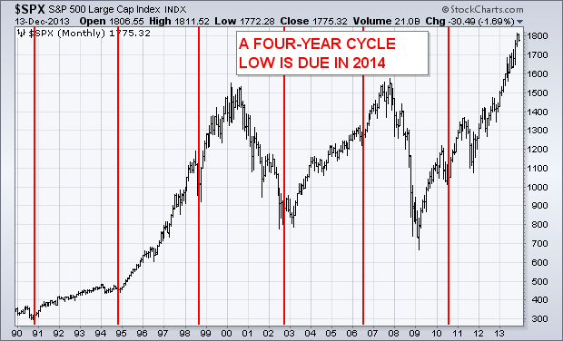
According to the Stock Trader’s Almanac, the two first years of the Presidential four-year cycle are usually the worst with the last two usually the best. Bear markets usually occur during the first two years. Since 2013 (the first year of this term) was so strong, historical odds for 2014 (the second year) to suffer a correction are pretty high. The chart above overlays four-year cycle lows on the SP 500 going back to 1990. The vertical bars show the last six bottoms occurring in 1990, 1994, 1998, 2002, 2006, and 2010. Earlier four-year patterns (not shown here) occurred in 1970, 1974, 1982, and 1987 (the cycle skipped 1978 while 1987 was a year late). Most of those bottoms took place during the second half of those years (mainly around October), and have coincided with midterm congressional elections. Assuming the four-year pattern repeats, the next bottom is due in 2014 and most likely during the fourth quarter. That carries both good and bad news. While the second year of a presidential term (like 2014) is usually the weakest, the third year (2015) is usually the strongest. If the 2014 presidential cycle holds true, the bad news is that it is likely to experience a noteworthy stock correction; the good news is that correction should lead to a major buying opportunity later in the year.

You might be wondering if every 2nd year of a presidency is bad shouldn’t I exit stocks now.  My response is no, not yet.  Since we cannot predict the future and seasonality patterns are NOT guaranteed, it is important to wait for a signal before you take action. One thing I like to do is watch how stocks perform in January. Why?  Because a down January stock market serves as a warning – According to the Stock Trader’s Almanac, every down January for the S&P500 since 1950, without exception, preceded a new or extended bear market, flat market, or a 10% correction. 12 bear markets began, and ten continued into second years with poor January’s. When the first month of the year has been down, the rest of the year followed with an average loss of 13.9%. In most years, these declines later provided excellent buying opportunities. For example, 2008 was the worst January on record and preceded the worst bear market since the Great Depression. But 2009 proved to be one of the greatest buying opportunities in American history. For me until we get a signal otherwise, staying course with the primary bull trend makes sense but with a vigilant eye for some sort of a warning flag from the market is sensible.

Merry Christmas and Happy Holidays everyone. This will be my last post for 2013 so I wish everyone a warm, safe and prosperous 2014.


Dec 16, 2013

Last week I posted about the high probability of a bullish end to the year. In an effort to be balanced and show all sides, this week I would like to provide a look at the bearish view. Cullen Roche of the pragmaticcapitalist.com wrote a nice bearish piece that is worth reposting. I know it’s not fashionable to be bearish about anything these days, but I guess I just can’t kill the old risk manager in me. Given this predisposition, I wanted to highlight some potentially bearish indicators that have been popping up lately.  I’ll highlight three such indicators:

1)  The first indicator is from Thomson Reuters.  It shows the S&P 500′s negative-to-positive guidance trend.  According to TR the current reading for Q4 of 11.4 is at its worst level since they began recording the data.  Of course, this sets the bar low for Q4 earnings, but we have to wonder how much this will filter into 2014 earnings where analysts are currently expecting double digit growth.

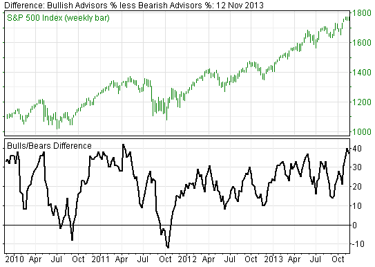
2)  The second chart is the Investor’s Intelligence bull/bear difference.  This is a sentiment reading that tends to reach extremes when sentiment is heavily skewed in one direction or the other.  The current reading just shy of 40 has not been seen since summer of 2011 before the last significant sell-off.

3)  The last indicator is a potential indication of how stretched the two above indicators have become.  It shows the S&P 500′s year-to-date return broken down by actual earnings growth and multiples expansion. Earnings growth is what the actual growth in earnings while multiples expansion represents what buyers are willing to pay for this stream of earnings.  As sentiment has soared investors have become increasingly willing to pay for a reduced share of EPS growth.

The bottom line here is that from the recent 26.5% return on the SP500, only 17% was due to an increase in corporate profits. The rest is investor enthusiasm and willingness to pay higher prices to own stocks.  I don’t know about you but being the tightwad I am I prefer to not overpay for anything …. Even stocks.

Some food for thought….