Ratio Love

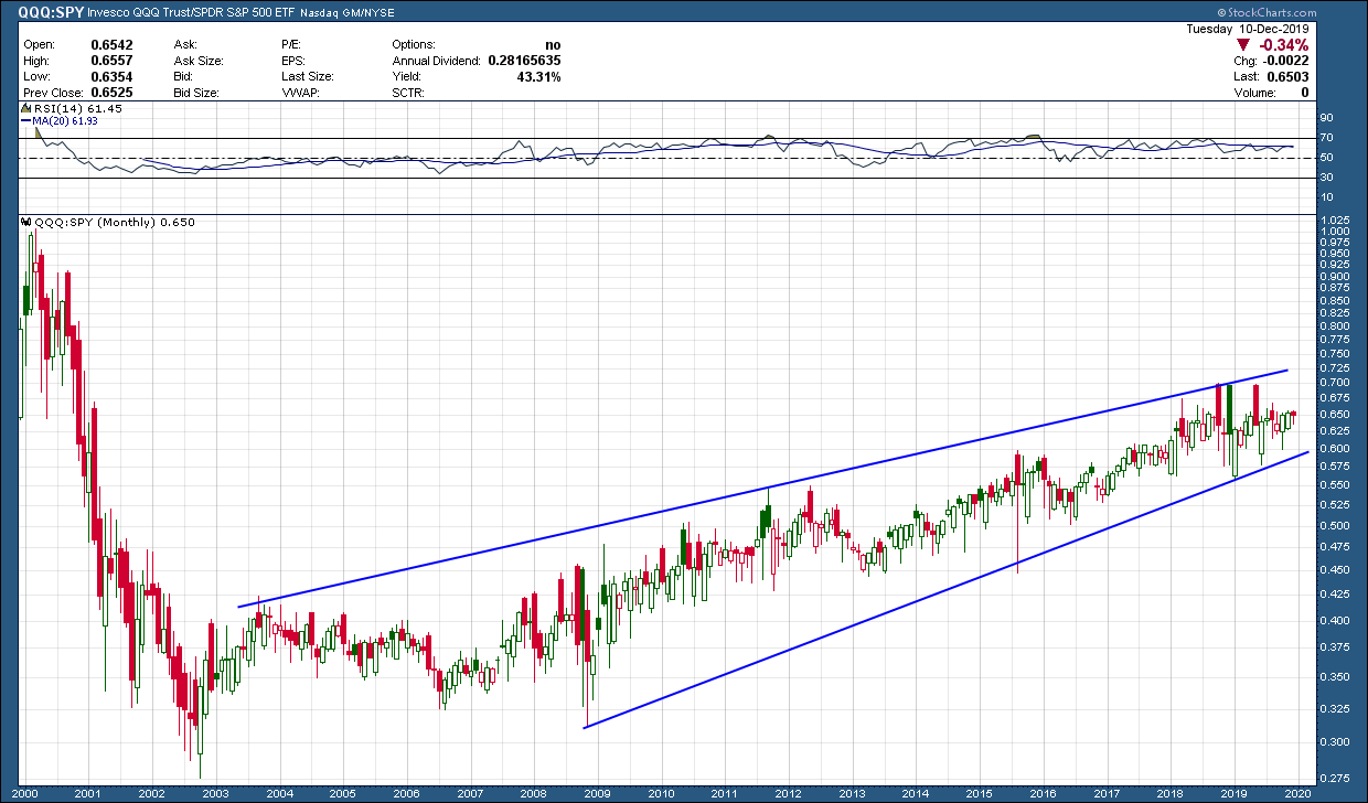
After bottoming in 2003 after the 2000 tech wreck, the technology sector (QQQ) has been the place to be when investing in US equities. As you can see in the ratio chart of the technology index, QQQ, to the broader sp500 index, it has stayed in an upward rising channel the entire time. From that bottom (17 years ago), technology has outperformed the sp500 by more than 130%. There is nothing in the chart, as of now, to say this is changing.

technology or sp500.png

If you didn’t care about diversification and there was a plan on how to manage, it’s safe to say all investors would have preferred the outsized returns that a technology concentrated portfolio provided. The beauty of ratio charts is they can help identify the places to be and more importantly not be, to help outperform when long trends persist.

Presidential Cycle

I had a blog post all ready to go on Friday for release on Monday and then I got the latest from Tom McClellan over the weekend and had to bury mine. I repost his studies often because not only are they interesting but more importantly for investors, they are based upon actual data (rather than opinion) and actionable. Here is his latest and relevant missive on the presidential cycle and US stock market., something that has historically provided a signifcant edge ….

 =========================================

Presidential Cycle Pattern and an Election Year

12-9-19 blog image1 financial advisor.gif

 Now that we are less than 12 months from the next presidential election, it is appropriate to talk about how the stock market typically behaves during an election year.  The short answer is that election years are up, on average, although not as strongly as the 3rd year of a presidential term.  And when an election year sees a down stock market, as in 2000 or 2008, it is bad for the party in power. 

This week’s chart shows our Presidential Cycle Pattern, which is an average of the SP500’s behavior over the 4 years of each presidential term.  I choose to use a different definition of “year”, rather than the normal calendar year starting on January 1.  I instead employ a count which starts each year on Nov. 1, to better align with the timing of the presidential election.  I have found that the stock market starts reacting to whoever gets elected almost immediately, rather than waiting for the Jan. 20 inauguration to start reacting. 

Generally speaking, the stock market goes sideways during the first two years of a president’s term in office.  This is especially true in the first term of a new president.  When a new president takes office, he typically spends the first 2 years “discovering” that things are even worse than he told us during the campaign, and that the “only solution” is whatever package of tax hikes/cuts and/or spending increases he hopes to get approved by Congress.  Investors tend to get bummed out by hearing that conditions are worse than they thought, and so they are not in a mood to bid up stock prices.

Then after the mid-term elections, the new president typically spends the final two years of the term declaring victory for having fixed everything, and running for reelection.  Investors respond by feeling better about hearing that everything is better now, and they tend to bid up the stock market during the 3rd year.  Election years are iffier, because they hold the risk that we all might have to get used to some new President taking office, and so election years are still mostly positive, but not as much as 3rd years.

When President Trump won the election in November 2016, the stock market initially had a negative reaction, with SP500 futures getting locked limit down (5%) overnight, but then rallied strongly the next day and beyond.  Curiously, though, the pattern of the SP500 during President Trump’s first 2 years did not correlate very well at all to the Presidential Cycle Pattern (PCP).  Everyone seems to agree that President Trump is a “different sort of president”, and maybe that is the explanation for the curious lack of correlation.

Then starting after the spike bottom on Dec. 24, 2018, the SP500 started correlating really tightly with the PCP, as if a switch had been flipped and prices got locked into what the script says.  Maybe President Trump is becoming more of a “normal” type of president now.  Naahhh, that cannot be it.

This next chart zooms in closer on just the immediate relationship between the SP500 and the PCP:

12-9-19 blog image1 certified financial planner.gif

It allows us to see that even as the correlation between the two has tightened up a lot, there are still moments when prices get off track from what the script says.  Sometimes that makes sense, as a news item moves prices in a way that is different from the historical record.  Other times are problems with the PCP, like mid-October when the PCP shows a big downward skew courtesy of the effects of the October 1987 crash on the average price data. 

We are now in December, which has a record of being a really strong month in terms of seasonality.  That is true also in the year before the election, although it is important to note that December’s strength tends to be concentrated in the last half of the month.  The first half of December sees a pause/correction, and that is what we appear to be going through now. 

Such pauses are healthy, and helpful to the sustaining of an uptrend. They set everyone to muttering about how the bull market is over, and prices are going down, and the sky is falling, and we’re all going to die I TELL YOU!! Once that is accomplished, prices can start higher again, and they should start higher into January, assuming that the SP500 continues to follow its average pattern shown in the PCP

I'm In Your Camp

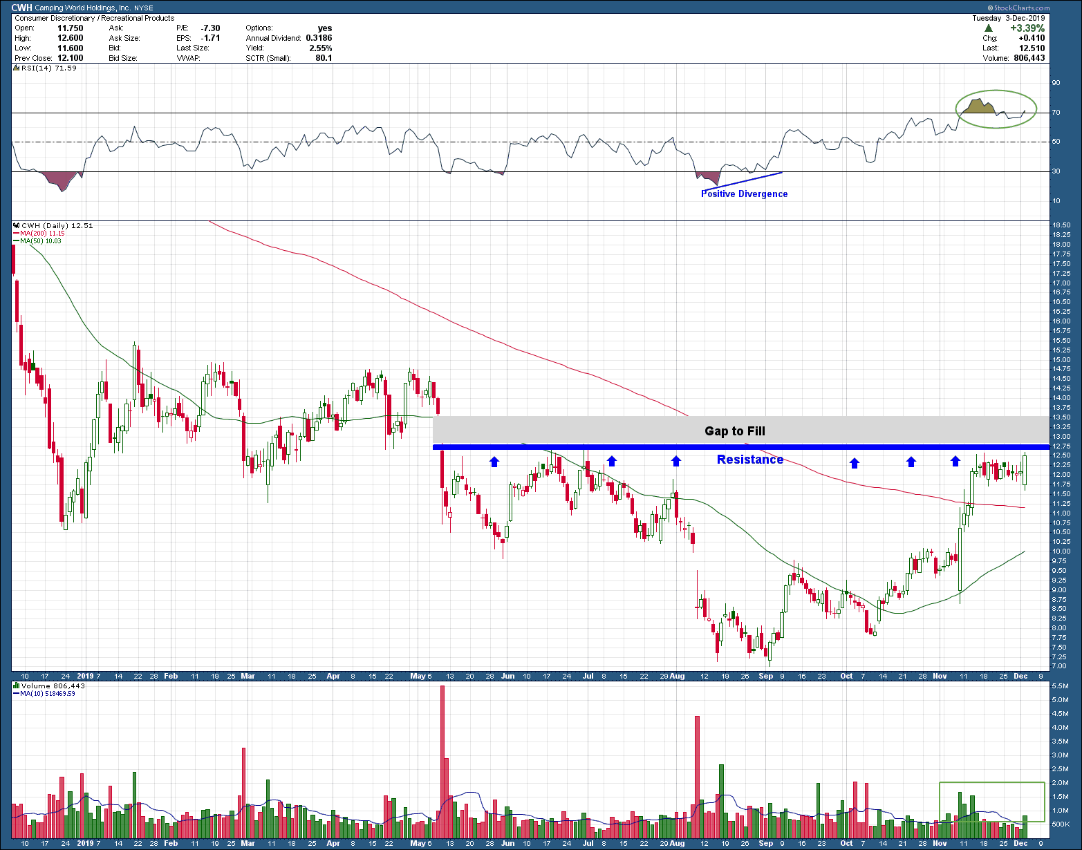
After peaking in December of 2017, camping world holding stock, CWH, fell almost 85%, bottoming in September of this year signaled by positive momentum divergence. Since that time, the strong bounce off the bottom hit resistance at exactly a point we would expect as it failed to move higher many times in the past. In addition, momentum has moved from an oversold to overbought condition which needed to be unwound. The recent 14-day consolidation has allowed it to do just that. Notice volume in the bottom pane has shifted from institutional distribution (selling) to accumulation. When the boys with big wallets want a stock, so do I. Price is above the 200-day moving average after more than a year and half as well as being above a rising 50-day moving average. What makes this more compelling is the relative strength it showed yesterday. While the market was down ¾%, CWH printed an engulfing candle with huge volume, rising more than 3%. When the market is ready to go up again, this stock is one I want to own. Its easy to see why this is a very constructive chart that points to a lot more upside. Maybe not immediately, but in the weeks and months ahead.

12-4-19 blog post cwh - I Am in Your Camp.png

Over time, I could easily see this stock being at least a 2 bagger (if not a triple) for those that have investment capital to risk and can stomach the volatility.

Almost Perfect

Since 2006 the price of gold has tracked the inverse of US 10-year rates (10-year treasury prices) with uncanny accuracy as you can see in the chart below. A 90+% correlation of two unrelated investments for an extended period of time is rare. As an investor, if this were to hold, and you strongly believed US interest rates were going to rise, a good hedge to protect yourself from falling rates would be to buy gold. Of course, the opposite is true too. Rising 10-year rates/falling treasury prices could be offset by shorting gold.

san ramon fiduciary fee only napfa financial advisor  goldvsbonds 12-2-19.png

While investing this way may sound well and good, I have found buying (or selling) an investment based upon the movement of another investment rarely works out over the long term. Correlations come and correlations go. What doesn’t, is Murphy’s law. Just when you discover the correlation and place an order to take advantage, the correlation no longer works. This is why it always makes the most sense to make investment decisions based upon the price movement of the investment you want to invest in. Nothing more, nothing less.

Hmmm

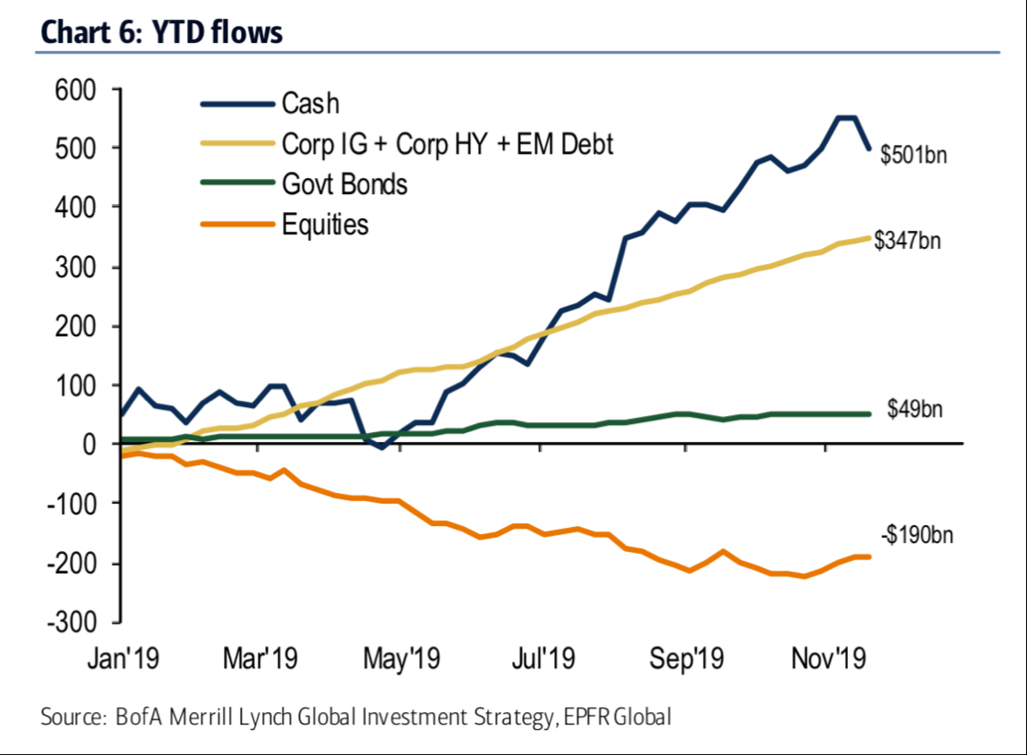
Looking at the year-to-date flow of funds into different investment types should make one scratch their head in wonder. How can stocks be having the bang-up year they are having when investors are fleeing for safe havens?

san ramon fiduciary fee only napfa financial advisor  goldvsbonds 11-27-19.png

One simple and probably accurate explanation is investors, on the whole, get it wrong way more than they get it right. The good news is this has the potential for setting up a continuation into next year. Why? With so much money moved into fixed income investments, as stocks continue to rise, FOMO (the fear of missing out) becomes much greater providing ample fuel for a prolongation of this bull. HEDGE WARNING!!! Of course, this assumes no major event triggers a selloff (like impeachment, worsening of trade wars or, god forbid, fake hot dogs).

See you next week on cyber Monday. Get your credit cards warmed up

Happy Thanksgiving.