Fun with Analogs

The recent analog chart put together by Fidelity and Factset is interesting. As you can see below, they plotted 27 months of stock market performance data, normalized it from 4 different time periods, ’94, ’96, ’11 and current (black). What falls out is an analog. A tight correlation between price action from the bottom of each cyclical adjustment bottom. With the black line being where we are today, it implies investors should expect smooth sailing for stocks through September of next year. Why September? I have no clue on what or why the stopped the data from there. My guess is the analog fell apart as the data diverged and no longer held.

cfp financial advisor in san ramon california.jpg

Before anyone goes out and mortgages their future and goes all in on stocks based upon the analog playing out, like everything that has to do with investing, there are no guarantees. I have seen dozens of analogs and most of the time they are created (data mining) to support someone’s thesis/prediction of the future. In this instance, this is not the case. In my experience I have found analog’s accuracy no better than flipping a coin, no edge and certainly nothing to bet the farm on.  What I find most interesting with this analog is, if it were to hold true for the current period, it would end right before …. Our presidential election. A period I expect to be the most violent and volatile period we will have gone through in a long time.  Grab some popcorn and a comfortable chair as only time will tell how this all plays out.  

Still Under-performing

Other than a few intermittent spurts, US small cap stock performance has significantly under-performed the broader market SP500 index for more than a year and a half. In fact, it has lagged by more than 14% over this short time. Unlike the broader market and other sectors (i.e. technology) small caps have not yet broken out to new highs.

Small cap strength is typically a pervasive element in a strong stock bull market. Looking at the small cap index chart, IWM, below, we can see it is stuck in a sideways, consolidative rectangle pattern. Each time it has reached the upper boundary, it has found resistance (supply) and reversed course. The bottom of the rectangle has acted as support as buyers step in to defend those prices when prices test those levels.

san ramon fee only napfa investment advisor 11-13-19  iwm.png

 With short-term bullish sentiment rampant and at extreme levels, until we see small caps breaking out to new highs, we need to keep our bullish enthusiasm in check. While we are ripe for a short-term pullback, it would be healthy if it did. It would allow some of the froth to be unwound and likely set up the market to tack on more gains through the balance of the year with a high probability of small caps being brought along for the ride.

Stocks and Taxes

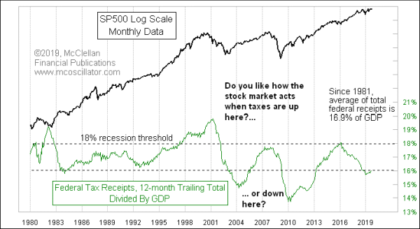
Leave it to Tom McClellan to look at how stocks react to the tax rate (as a percentage of GDP). I find this data absolutely fascinating. The good news is, at least as of right now, if stocks are to fall, it won’t be because tax rates are too high. Take a look at Tom’s most recent study below. For those interested all his studies can be found (free) at www.msoscillator.com.

Treasury Department Is Not Biting Too Hard

 The good news for the stock market bulls is that the federal government is not taking too big of a bite out of Americans’ incomes.  The latest data from the Treasury Department show that total federal receipts from all sources for the 12 months ending September 2019 amounted to 16% of GDP.  That still seems like a pretty high percentage empirically, but it is below the average of the past 4 decades.

This week’s chart compares that measure of the tax bite to the movements of the SP500.  The important lesson is that pushing taxes up too high tends to cause recessions and bear markets, eventually leading to a falloff in total tax receipts.  Generally speaking, 18% qualifies as “too high” because we have seen a recession every time it has gone up there.  Even getting close to 18%, as we saw in 2007 and 2016, can lead to economic distress.

11-1-19a.gif

But lower readings like we see now tend to be followed by months or years of uptrend for stock prices.  More money gets left in the hands of taxpayers, and so they can do things like bid up stock prices with it. 

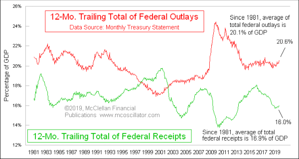
The problem is that taking in 16% of GDP in taxes does not pay the bills.  The last 12 months’ expenditures by the federal government amounted to 20.6% of GDP.

11-1-19g.gif

For FY2019, which ended in September, total raw dollar receipts were up 4.0%, which is pretty good.  But total raw dollar expenditures were up 8.2%, because our elected leaders in Washington, D.C. cannot get control of their spending impulses.  It is a spending problem, not a taxing problem.  And it does not help that Baby Boomers are entering retirement and starting to draw Social Security and Medicare in larger numbers than the older generations are dying off.  So we have a spending problem, and an actuarial problem, but not a taxing problem.

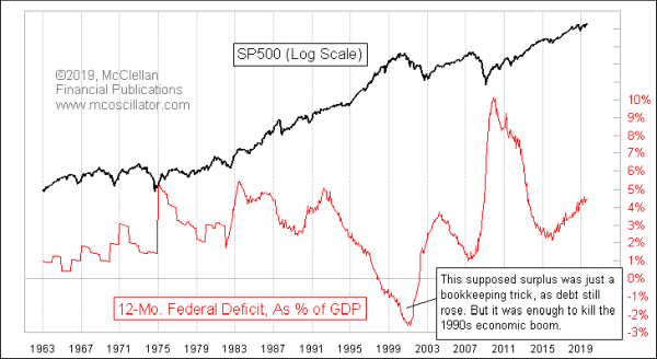
And those problems are really only a concern to those of us who don’t want to leave a mountain of debt to our grandchildren.  For investors, a deficit like that is an enormously stimulative force for the stock market.  Here is that comparison:

11-1-19c.gif

The higher the deficit now, the more bullish it is for the months that follow.  Deficits only become a problem for the stock market at the point when somebody tries to do something about it.  But while they are at a high level and climbing, it is reminiscent of the old saying, “A fool and his money… are some party!!

Avoiding Land Mines

With one of the downsides of owning individual stocks having been recently eliminated (trading costs), the biggest one (earnings surprises) becomes a bigger concern. In the early stages of bull market (think 2009), news and earnings tend to have positive impact on stock prices. Regardless what is reported. Why? Because investors have very low expectations and, as such, even bad news turns out to be good since it is not a surprise. As you would expect, the opposite is true too. As an aging bull lingers, expectations become increasingly higher (priced to perfection) and even good news often turns out to a land mines for stock prices. For this reason, as this bull market has persisted, my default action is to not hold individual stock positions through earnings announcement.

Yesterday we reluctantly sold MTCH position in client portfolios as it has been a nice winner, up >20%, because they were announcing their earnings results after hours. They were down as much as 20% immediately following their announcement but have tempered the losses somewhat this morning. Here is today’s chart, reflecting the markets opinion on their announcement.

san ramon fee only napfa financial advisor investment management 11-6-19  mtch.png

Tempered reaction aside, this chart now looks very ugly and one that is screaming to avoid and potentially setting up to eventually be a decent short setup. Not the predominance of selling that has occurred since price topped out in August. For those watching, this is a huge sign the institutions have shifted their opinion on MTCH from buy to sell.