Investments

A Quick Round Trip

Back on 2-18-15 I wrote a post on JC Penny’s stock, JCP, proclaiming the virtues of what the charts were saying.  Here we are 7 weeks later, I am back at you with a recommendation to sell the stock (at least ½ if not the entire position), as I did today.  After a 12% while the SP500 was down fractionally during the same period, locking in some profits seems prudent right here. 

At the time of my initial post here, an inverse head and shoulders pattern had set up and projected an upside target of almost 40%.  That target combined with its risk/reward was so compelling it was one I couldn’t pass up on.  Those that remember this post may be wondering why, if the target was almost 40% higher, would I be selling now only after a 12% gain.   Below is a chart I posted at the time.

Below is the same chart 7 weeks later. Notice how price spike immediately higher after my post and was rejected at the first grey resistance line around $9.25. Once hitting that, It corrected lower, in fact, falling below my entry point and back down almost to the right shoulder.  At the time I really thought I would be eating crow. Thankfully, my stop placement just below the right shoulder worked out perfectly as it was not hit and price immediately pushed higher back up to the grey resistance line today where it was, once again, rejected.  This tells me this price level is hot and must be respected and as such I expect further consolidation and likely more downside from here. It does not mean it cannot eventually reach my projected 11.25 ish target price but, the pattern that made it such an attractive investment has been invalidated. So taking partial, if not all profits, is warranted.

I am circling back around to this post not only because it turned out to be a nice investment gain (an 89% annualized return is nothing to sneeze at), albeit a short holding period, it also turned out to be a great learning tool. Here is what you should take away from this example.

1.       When investing make sure you clear your mind of biases and opinions. They can be very detrimental to making profits.  Before this recommendation who really thought this investment, JC Penny’s, was going to outperform (and in this case massively so) the index?  If you reread my post I had my doubts but what I have learned is to let those thoughts go and follow the charts (price)

2.       Have a plan before you invest.  You aren’t always going to be right so know what price level that is and make sure you incorporate that into an exit strategy that is established BEFORE you invest.  If you are going to take a loss (and losses are a part of investing) keep the size of each loss small.

3.       Taking profits on a portion of your position, once it hits your first level of resistance (these, like your loss exit point should be determined in your investment plan before you invest) and then adjusting your stops accordingly on the remainder will guarantee you can NEVER lose money on that investment. This is good risk management and should be considered on every investment. Sure, it doubles your transaction costs, but the cost of a transaction is so small as compared to most investment losses (even those with a plan), it is a practice all investors should follow.

No Foolin'

It was almost 2 years ago I wrote about a developing rising wedge in the SP500 which had potentially bearish implications. As it so happens the bearish breakdown never happened and we continued to push higher. As it turns out, and for all the negative references analysts use to support their arguments as to why prices are going to fall, rising wedges have very poor predictive success. In fact they have one of the worst performance rankings, 20th out of 21 when looking at all patterns.

Fast forward to today and sure enough you can see in the chart below, the SP500 is sporting another rising wedge. The most disconcerting thing about this wedge is the projected target if it were to play out. About 12% lower than from where we closed out Q1. 

For these patterns that actually do breakdown, less than a 50% meet their target price objective (measured move). If you stop and think about it that makes sense because rising wedges typically occur in uptrends, in this case a very strong uptrend. Corrections in strong uptrends are characteristically short and shallow.

So while I don’t want to discount the pattern just because of its low probability, it is helpful to understand target support levels if we do see a breakdown … just in case this one is real. If price breaks the lower blue support line, the next level of support would be just below at the red horizontal price labeled S1, around 2040.  A break below that would find support at S1 around 1990 and finally if that does not hold, I would expect this to be one that falls all the way down to its measured move near 1820.

While I am not predicting a correction, this pattern has my attention. And until this pattern is resolved it is, at a minimum, a warning flag telling me it is not a time to be a hero and put more money into a long (US stock market) equity trade. Of course, things can change very quickly but looking at the bigger picture, there is nothing that is saying this bull market run is over rather we are in the middle of period consolidation in a longer term uptrend.

Have a great rest of the week

Benvenuti in Italia

While we all understand over the long run a diversified portfolio has provided better returns and lower risk, over the past 1-2 years it has also been the main factor of underperformance. Apart from a few exceptions, being invested in anything but US stocks has been hazardous to your portfolio. Knowing one of the most powerful phenomenon’s in investing (and life for that matter) being reversion to the mean, I know this US centric investment thesis can’t go on forever.  As such, each week we scour the world looking for investing opportunities outside the US that will present both good risk/reward and a means to a better diversified portfolio.

One country that fits all the requirement and is on our radar is Italy using their ETF, EWI, as a proxy. You can see in the middle pane of the chart below, the Italian stock market has fallen more than 29% since it peaked in the middle of last year.  The decline was nicely contained within the blue downtrend line as each time it tried to rally above it, it was promptly rejected and prices continued lower.  That all ended last month when price broke out, quickly fell back to retest the blue downtrend line and then immediately propelled higher. The other thing that should jump out at you since the breakout is price has continued to make higher highs and higher lows, which is the definition of an uptrend. This is one of the confirmations we look for before investing as trend followers want to invest only in things that are trending up.

While finding an investment that has fallen, has bottomed and begun a new trend higher is what we strive to find, we have found in today’s market there is no sense in using client investment dollars unless there is a possibility it can outperform a US alternative.  The bottom pane in the chart is a ratio of the performance of the SP500 to the Italy ETF.  You can see up until the start of this year where the ratio peaked, being invested in the SP500 had provide a better return by 45%.  Since that time three important events have occurred 1) the ratio broke below the blue uptrend line 2) the ratio broke below the blue horizontal support 3) the ratio is forming lower highs and lower lows.  These are all confirmations informing us the trend for the ratio has changed from up to down. 

With the US markets struggling to go higher and looking very tired (more on that in another post) Italy looks as if it is worthy of some equity investment dollars.  Rather than add to equity exposure, a swap from a US equity into Italy seems worthy of consideration.

italy.png


Social Media Stocks - The Phoenix Rises

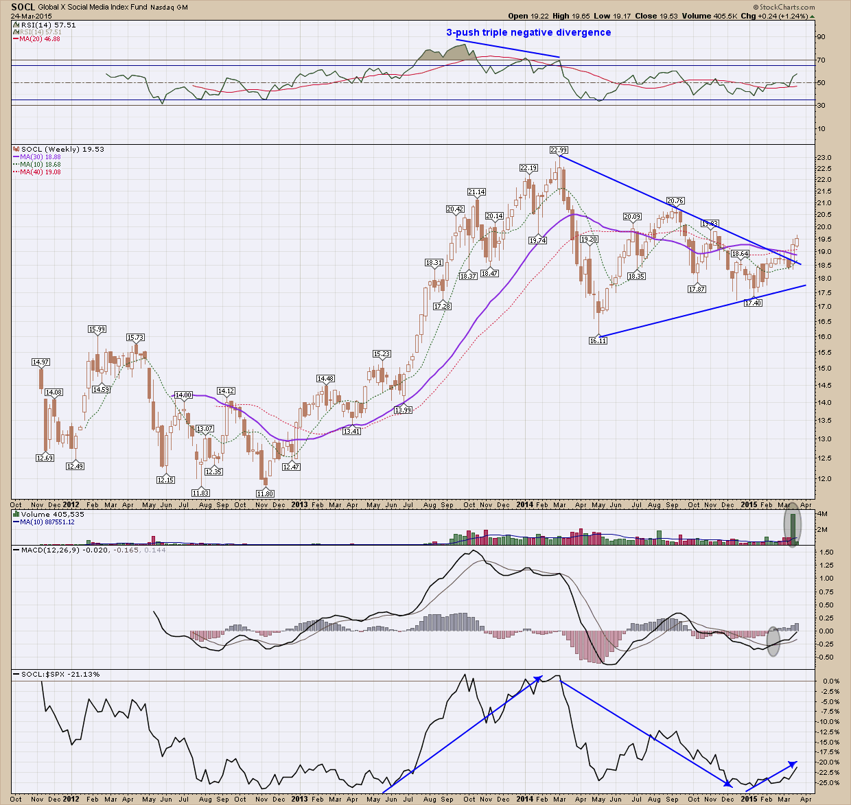
Besides the biotech sector, 2013-14 proved to be very favorable to social media as SOCL, the social media ETF, rose almost 100% from trough to peak.  On its final push higher in March of 2014, it created negative divergence which warned of a possible reversal, a correction at a minimum.  After losing 30% in that correction, price has ping-ponged for almost a year creating a sloppy looking symmetrical triangle. Triangles aren’t my favorite pattern to invest off of but the breakout last week had enough constructive indicator support to convince me this break has some legs. In the upper pane the RSI is moving higher and is above 50.  In the volume pane just under price, you can see we had an all-time volume week on the breakout which is the type of confirmation we would like to be present. Below volume the MACD has crossed over and continues to push moving higher, and just now crossing the zero line allowing for a lot more upside potential.  In the bottom pane which is the performance of this ETF as compared to the SP500 you can see the ratio bottomed and is, once again pointing higher making this a more attractive investment as compared to the index. While fundamentals aren’t something I put too much emphasis on short term, the stocks that make up this ETF such as Twitter, Facebook and Linkedin have the potential to be big long term winners.  When all the moon and stars are lining up like they are here, this is definitely worthy of consideration, depending upon your risk tolerance.