Investments

The Analog Channel

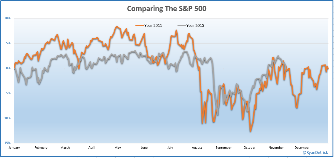
Mark Twain said “History does not repeat but it does rhyme”. You can take this truism about history and extend it to the investment markets. In fact, part of the basis for Technical Analysis is that the markets, which reflect the actions of all its participants, tend to repeat. Recognizing this and understanding how to use it can provide a significant advantage to its users. I must admit I have never found that analogs provide me any significant investment advantage but I do find them fun and entertaining (kind of like CNBC). Ryan Detrick, who I find to be one of the best market data analyst alive, posted this analog of 2015 stock market action against that from 2011.   Maybe it’s my brain that makes me want to see patterns that may not really be there, but I find the similarity pretty uncanny.

bay area investment advisor expert retirement planning

For those who may not remember, 2011 was the first (and last) bear market (more than 20% decline) since the end of the 2008-09 financial crisis.  After bottoming in 2011, prices chopped around for more than 6 months before we blasted off to new highs.  I remember thinking at the time the 2-year rise from the ’09 bottom was nothing more than a bear market rally. I couldn’t have been more wrong and later learned valuable investment lessons regarding 1) not predicting the future and 2) only pay attention to price!

Like 2011, we are stuck in the middle of a trading range. Breaking above the May high means we are once again back in a bull market and it’s time to expand our equity exposure. A piercing and close below last month’s low means it’s time to hunker down and get defensive. Until one of those two happens, I am going to grab some popcorn, find a soft, comfy chair and enjoy the analog channel.

A Cup of Hot Chocolate

Cup and handle formations, if formed correctly, are potentially a very powerful bullish continuation patterns. They start as a consolidation period in an uptrend followed by a breakout to new highs. As its name implies, there are two parts to the pattern: the cup and the handle. The cup forms after an advance and takes the shape of a bowl or a U. As the cup is completed, price is rejected at or near prior highs, a trading range develops on the right hand side and forms the handle. A subsequent breakout from the handle's trading range signals a continuation of the prior advance. During the formation, you would ideally 1) like the handle to not move lower than 50% of the depth of the cup; 2) see volume decreases during formation of the handle and 3) volume increase on its breakout.

After making new highs in October 2014 from the breakout of a 2013 W-bottom, cocoa is currently in the process of forming a very nice cup and handle pattern and the potential for an intriguing investment opportunity. It is never wise to jump ahead and project that a pattern in development is going to actually complete. First off patterns don’t always complete, even those with the best setups and secondly the little bit you gain in getting in early before its completion is not worth the risk if the pattern fails. I find waiting for the additional confirmation greatly increases your success rate. In addition to the pattern setup, notice how right now price is above the faster moving average which is above the slower moving average which is pointing up.  This bullish alignment is confirmation we are in an uptrend and is exactly the setup we would like to see before we enter any long position, not just cocoa.

bay area fee only investment advisor certified financial planner

If Cocoa decides to actually follow through and complete the cup and handle by breaking above the rim of the cup (red horizontal line), the opportunity is quite attractive as the pattern projects to a 25% increase over the coming months.

The Deflationary Boogeyman

Commodities have been a horrendous investment since they peaked in 2008. Since that time, using the $CRB commodity index as a proxy the index, has lost almost 60% of its value and those investors who have bought and held have been crushed. This is reflective of the ongoing deflationary cycle that started in 2008 and what central banks around the world are trying to fight, many using untested and potentially dangerous means. I have learned it is best to avoid political or third rail sensitive topics and keep my posts solely about investing, the fact is I have major doubts this misallocation of capital and demand pull they are causing will end positively. They are using everything they have in their arsenal and are running out of options fighting the deflationary boogeyman trying to create inflation.

For those who listened to last month’s market recap, I mentioned the elephant in the room was the dollar as it appeared to be breaking out of a consolidation pattern to the upside and the potential impact on investments. In today’s post I wanted to show how I came to that conclusion. The chart below shows RSI momentum in the upper, the dollar in the middle and the $CRB index in the lower pane. What should jump out at you besides last week's breakout of the triangle, is the strong inverse relationship that exists between the dollar and the commodity index. When the dollar rises, commodity prices fall and vice versa.  For the sake of this discussion, if you assume my analysis about a rising dollar correct, you can see how a breakout higher could have very serious consequences on commodity prices.

Triangle patterns by themselves are some of the most notorious patterns for false breakouts so I am cautious in my breakout call and continue to wait for further confirmation. On the flip side, bull pennants which are a long pole attached to a triangle, are much more reliable and typically mark the halfway point of an entire move. Using that info to project forward, another move higher by the dollar equal to the most recent move could poleaxe commodities another 40% or more. Clearly the market could do anything and my hypothesis is but one possible outcome, but if this were to occur, savvy investors should look to find ways to capitalize on this move as the potential is captivating.

bay area fee only independent financial advisor pleasanton

Dead Cat Bounce?

The energy sector has been the whipping boy of the US market for the past 18 months or so. XLE, one of the big “2” energy sector ETFs, has lost more than 40%, high to low, during this time. In the weekly chart below you can see in August price bounced off prior support in the $57.5 area as it did in mid-2012. It should be easy to recognize we are in a downtrend as price continues to make lower highs and lower lows and has stayed below the downward pointing 40wk moving average which has acted as resistance the entire move. Additionally, RSI momentum in the upper pane has confirmed the bearish trend change as it has transitioned from the bullish range (40-80) to the bearish zone (20-65). When all of these align up together as they have, it is an indication of a strong downtrend.

All trends eventually end and at some point energy investments will turn out to be a compelling long term buy but until the following occurs I view the current bounce off support as a short term trade only.

1)      Price makes one two higher highs and one higher low

2)      Price moves above the 40wk moving average

3)      The 40wk moving average has a positive slope

4)      Volume needs to confirm the upward price movement by rising as prices rises and decline as price consolidates.

bay area investment advisor certified financial planner wealth manager

While it is not ideal, the current movement looks eerily similar to the prior other 2 bear flags that formed since price peaked last year. I hope my analysis is wrong but when looking at the weight of the analysis, I expect we get another leg down, likely occurring after finding resistance at the upcoming 40wk moving average. Traders will see that as an ideal time to short and capitalize on the ongoing energy weakness entering on a dead cat bounce.  For longer term (long only) investors, look for the next leg down (the $40 level looks like a logical target) to create an oversold divergent low which, if it occurs and is confirmed by the 4 requirements above, will present an excellent long term entry signal.