Investments

Sipping The Long Bond

In the early part of 2015 the US long bond proxy (TLT) peaked right at $134/share. I remember it well as the bond bears were out in force predicting the end of the world for those who owned bonds. They had a good reason to believe this was going to be the case, remember the FED started jawing very loudly about raising rates. And rising rates is not good for bond holders. From that point, TLT lost more than 16% (peak to trough) at the same time unwinding its overbought condition in its downward consolidation.  But a funny thing happened the fundamental story stopped working. The market apparently inserted its earplugs because TLT's price has been in an upwards trajectory since the June low and is now just $2 away from the Jan 2015 high.  This is a great example of why paying attention to just fundamentals or the talking heads can get you in trouble. Price is all you need.

As you can see in the weekly chart of TLT below, the past year and a quarter price has consolidated and formed a very nice cup and handle continuation pattern. This consolidation has the (red) 200 day moving average change from down, to flat, and to now up.  Additionally, the overbought RSI momentum condition has had time to unwind but not too much as to send it into the bearish zone. Finally, with cup and handle patterns additional validation comes from seeing volume decline when forming the handle of the pattern which is exactly what occurred.

Pleasantons best financial advisor investment expert, cfp retirement planner - 5-18-16 TLT

As with all chart patterns, this cup and handle is no different and will need to confirm before it becomes valid. This would occur with price closing and holding above the rim of the cup (~$134), which it has not yet done. And because we are up against major resistance combined with the fact today is a FED day and their announcements (unfortunately) can and do move the markets, I am not convinced this “continuation” pattern will actually continue. It could just as easily turn out to be a major reversal level and the pattern fail. Either way, the ramifications to all markets could be enormous and as such all investors need to keep what happens to bonds front and center.

As a side note, knowing price patterns can greatly help increase your success rate when investing. But buying or selling in anticipation of the pattern development and confirmation provides no edge at all and, in my experience, will hurt your returns.

A Suicide Shot

What’s a suicide shot you ask? - Squirt a lime in your eye, snort a line of salt then finish it off with a shot of 180 proof alcohol. Sounds like a killer time, eh?  You’re likely not going to die but there will be a lot of pain with little upside (other than your friends can laugh at your foolish escapades). This sounds as much fun to me as investing in the US stock market right now.

While the markets (and my opinion of them) can change on a dime, I wanted to show you 4 charts, 3 different US stock sectors and one of the SP500 as examples of what I am seeing and why I am so sour to committing investment capital to the long side at this time.

The first chart is that of the US small cap proxy, IWM. You can see for the last year it has formed a series of lower highs and lower lows and the red 200 day moving average has a negative slope. In addition, a head and shoulders (red) top has formed but yet to trigger as price still remains above the blue neckline. A break of the neckline and I think cascade lower and challenge the Feb lows.

Bay area best financial advisor retiremenmt planner serving all of california

We all know that a healthy stock market requires a healthy banking sector so it’s always good to take its pulse.  The banking sector looks very similar to the small caps as we have a series of lower highs and lower lows combined with a downward sloping 200 day moving average. And, while I do not show it (in an attempt to keep the charts as clean as possible) the most recent April peak has formed overbought negative RSI momentum divergence.

Pleasantons best retirement and financial planning investment advisor

My next chart is that of the Nasdaq 100, QQQ, a proxy for large cap technology stocks. The 200 day moving average has been flat for months but just recently started to slope downward. A huge head and shoulders topping pattern (blue) has been forming since August of last year. In addition, notice how the right shoulder of the bigger pattern has formed its own mini (red) head and shoulders pattern. While neither has broken their respective necklines, this is an extremely bearish setup and portends of lower prices. The one upside and difference from the other charts above is that we have not formed a series (at least 2) lower highs and lows yet as we have had only one lower high (back in April) combined with two lower lows.

bay areas best retirement planner cfp, wealth advisor

My final chart is that of the SP500. This chart should look familiar as it shows a series of lower highs and lower lows combined with the 200 day moving average sloping slightly south. Also, the most recent consolidation from late March to present has formed a symmetrical head and shoulders topping pattern.

Pleasanton retirment planning expert financial advisor serving bay area investors

The market feels real heavy here and I feel is looking for a catalyst … in either direction.  Any daily rally that hasn’t reversed and turned red have been weak and the sectors you want to be leading, aren’t. My $.02 is if the bulls cannot take control and push this broader market to all-time highs soon, the bears will take it lower and make a run at forming the next lower low. Putting that aside, this week being OP-EX (option expiration) tend to be pretty bullish so if they bears were to grab the market, in spite of the ominous looking charts, I expect some patience will be needed.   

Is a Big Sale at Macy’s Right Around the Corner?

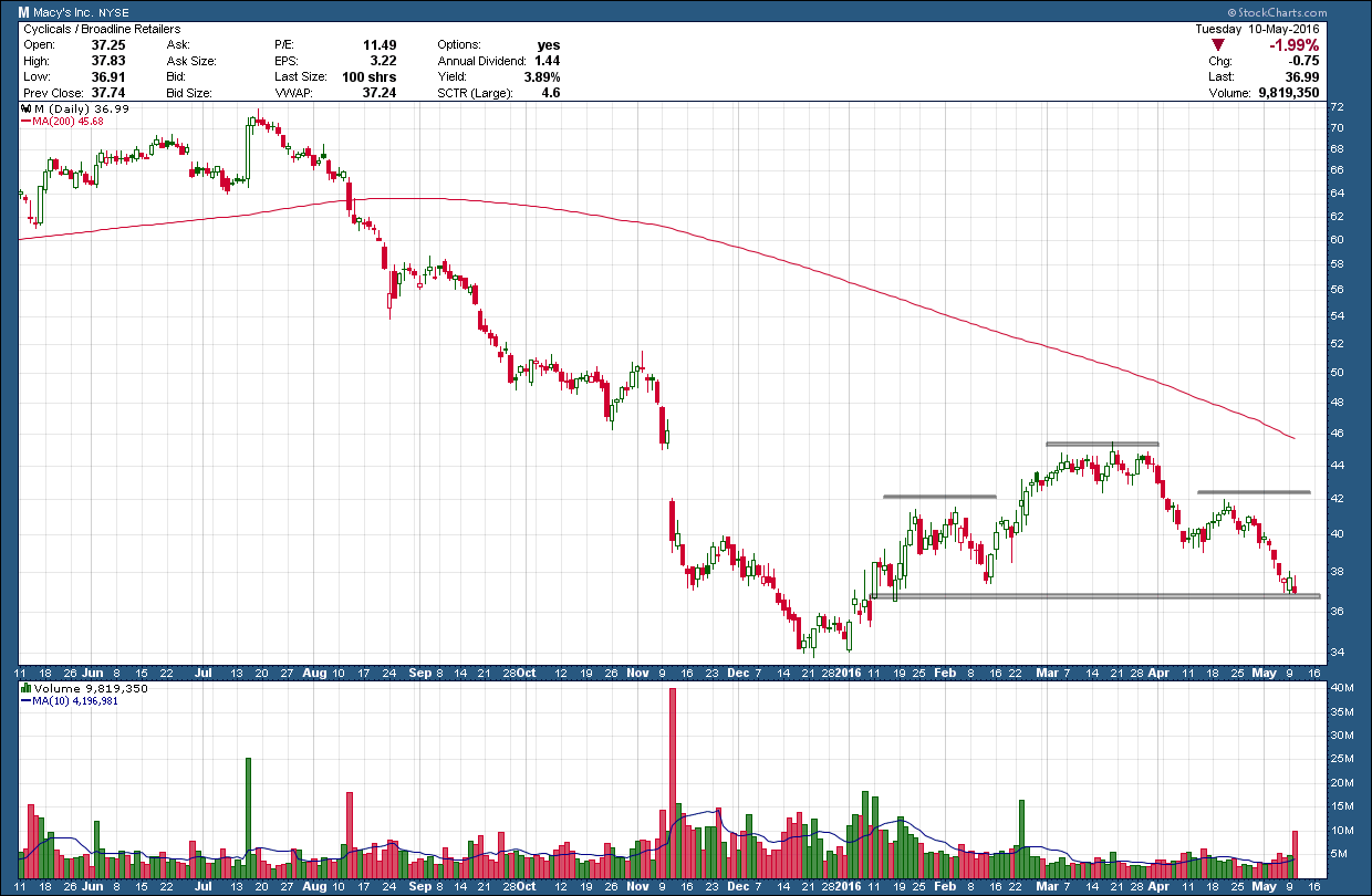
I have been watching in awe the unwinding of Macy’s (M) stock for the past 9 months as it peaked at almost $72/share last July. I am so disappointed I missed the huge profit opportunity it created on the short side. Since that time you can see in the weekly chart below its share price has been more than cut in half bottoming just under $34 in December. Since then it has formed a huge topping pattern that, if you squint real hard, looks kind of like a deformed head and shoulders (H&S) pattern. A thing of beauty and symmetry, it is not. In addition, if it were a true H&S pattern its projected target is zero. Macy's would be going out of business. Not likely! For this reason I ignore the pattern but can’t ignore the rest of the chart. With a strongly downward pointing 200 day moving average and RSI momentum in the bearish zone and falling, combined with lower highs and lower lows hints of more downside for the stock.

Investment Advisor bay areas best CFP - 5-11-16 Macys1

Quite frequently when looking at weekly charts you will see smaller, shorter term patterns form within the much larger pattern and Macy’s is no different. Zooming in more closely at the right shoulder of the H&S pattern on the chart above we can see a smaller, more symmetrical and better formed H&S pattern that is sitting on important support as shown below. This pattern has a much more reasonable downside target in the $27 area if it were to trigger and complete.

Financial Advisor bay areas best retirement planner - 5-11-16 Macys2

With Macy’s (M) reporting earnings tomorrow I wanted to get this post out ahead as it could be the catalyst to start its next leg down. While I don’t give it a high probability and because news trumps the charts, if they blow away the number that December low could turn out to be “the” bottom and marks the start of a new uptrend. Either way, this is going to be fun to watch!

Bear Trap 2

What I am not writing about

bay areas best investment advisor cfp retirement planner bear trap - 5-9-16

What I am writing about …

bay areas best financial advisor cfp retirement planner bear trap 2 - 5-9-16

While ever so slight, the US dollar index closed just below critical prior swing low support level a week ago and then immediately reversed higher closing back into the channel on Friday. While volume is not available as this is not a tradeable index, using the tradeable proxy (UUP) the reversal occurred on almost 2x the volume.

Bear Trap Definition - A bear trap occurs when shorts take on a position when an investment is breaking down, only to have it reverse and shoot higher.  This counter move produces a trap and often leads to sharp rallies.

With this weeks close back into the consolidation channel and combined with a higher close next week, this latest move could be a classic example of a bear trap. If so, I would expect we see a sharp rally in the coming weeks carrying the potential for the index to break out above the most recent 100-101 swing high.

Why do Bear Traps produce sharp rallies? - The first wave of buying will occur when the most recent broken support level is exceeded, due to the number of shorter term traders who have their stops slightly above the most recent swing high. The second wave of buying comes into play once the stronger realize that it is not just a dead cat bounce, but that the move has much bigger potential. This will produce the second bounce, which will often precede the short-term top in the counter move.

If all this talk about bear traps sounds vaguely familiar, it should. I wrote about another potential bear trap in the mining stocks back in February. Since that bear trap, the GDX has rallied almost 100%. Now, I am not saying the dollar will rally 100%, as that is all but impossible, but if this does turn out to be a bear trap the implications are enormous. A strong dollar can push bond prices higher (yields lower), make the recent rally in commodities, precious metals, emerging markets and large cap US stocks (with large foreign sales) a thing of the past as these typically move inversely to the dollar. Sure, money can be made by being long the dollar but it will pale in comparison to those who short those falling inversely correlated investments.

There are no guarantees, but if the dollar breaks higher, this is setting up to one be the best money making opportunities this year. Stay tuned as the next few weeks is going to get really interesting.

A Technical Look at Earnings

The fun thing about technical analysis is you can take virtually any data and analyze it through its lens. For example we all understand the positive relationship between corporate earnings and stock prices. Higher earnings = higher prices and vice versa. Earnings are a key tool fundamentalists use in their analysis of the markets to look at valuations and other metrics. Now, if I plot reported GAAP earnings on the SP500 companies against the price of the SP500 stock index over the past 20 years it would look something like this …

Best Pleasanton financial advisor expert with CFP - earnings vs spx 5-3-16

In the upper pane is GAAP earnings (blue line) and the lower is the SP500 index price. I have added a simple 200 day moving average to earnings (orange line) to smooth out its gyrations and use as a trigger line for a very simple investment system.  That system would be to sell stocks when earnings cross below the moving average and buy when they cross above.  I have added red vertical lines indicating where those sell signals occurred in the past.

While I have not back-tested this “system”, just using the ol’ eyeball test, it seems to do a pretty good job of avoiding a big chunk of major corrections and keeping you invested while the trend is rising. Like any system using moving averages it is susceptible to false signals/whipsaws like the one that occurred in 1998. Time will only tell if the recent “sell” signal turns out to be a whipsaw or not, either way investors should tread lightly here as the weight of the evidence is flashing warnings signs.