Investments

Coal Is Dead: It's Time to Accept It – “The coal industry is on life support, and that's not changing anytime soon”

This article title appeared in Motley Fool in April of 2015. Apparently, coal stocks were given some get well medicine because they bottomed early last year and have been one of the best performing sectors since. As you can see in the coal sector ETF chart, KOL, below, it has risen more than 180% since that January 2016 low. In case you are wondering, yes, this is quite typical and more often than not, what happens. By the time “the story” makes it to mainstream media (this was also covered in WSJ, and other more well-known media publications after April, 2015), savvy investors know it’s time to load up … on the other side of the media story boat. And in the case of coal, fading the news outlets was again, a profitable outcome.

CFP Financial advisor, fee only retirement planner - KOL - 4-20-17

The interesting thing is, there is a lot more room to the upside if coal finds a cure. You can see in the above chart, the red smaller inverse head and shoulders pattern played out exactly as expected and hit its upside target, T1.  But as can happen when an investment goes through a substantial decline and begins to recover, it creates (smaller) patterns within (bigger) patterns. This time is no different as the completion of the smaller red inverse head and shoulders created a larger, purple, inverse head and shoulders which, if played out. has an upside target some 60% higher. What makes this compelling besides the upside potential, is last week’s confirming breakout from the pattern as it gapped on the open on more than average volume.

The Oldest Country in Europe is Breaking Out

Did you know that Portugal has had the same defined borders since 1139, making it the oldest nation-state in Europe? I didn’t either and knowing that fact is probably not going to make you money but the Portugal stock market just might if you play the chart right. After more than 3 years and an almost 50% decline in its stock market it looks as if Portugal is setting an attempt to reverse course.

The chart is a technicians dream as it has set up perfectly for a move higher.

1.      Multiple periods of positive momentum divergence have formed, the latest at its lowest price

2.      Price is currently above the 200 day moving average which has flattened and just begun to have a positive slope.

3.      Price has formed 2-higher highs and 1- higher low.

4.      Price broke above important resistance (blue horizontal line) with conviction (big candle)

5.      The breakout in 4 above was confirmed on more than 5x volume as seen in the lower pane (normally look for 30-50% increased volume as confirmation)

6.      Price is breaking out of a consolidation base of 6 months or more (period under blue horizontal)

San Ramon independent fee only CFP invcestment advisor and retirement planner

You might be wondering as attractive as this set up is why I won’t be adding it to client portfolios. Unfortunately even if we were to only take a small position (say 2%) in each client portfolio that purchase would constitute more than 50% of daily market volume, making our clients “the” market. An amount more than 5% violates our investing rules so anyone reading who is managing their own money, consider this a freebie idea. I hope you make a ton!

The Jaws of Death

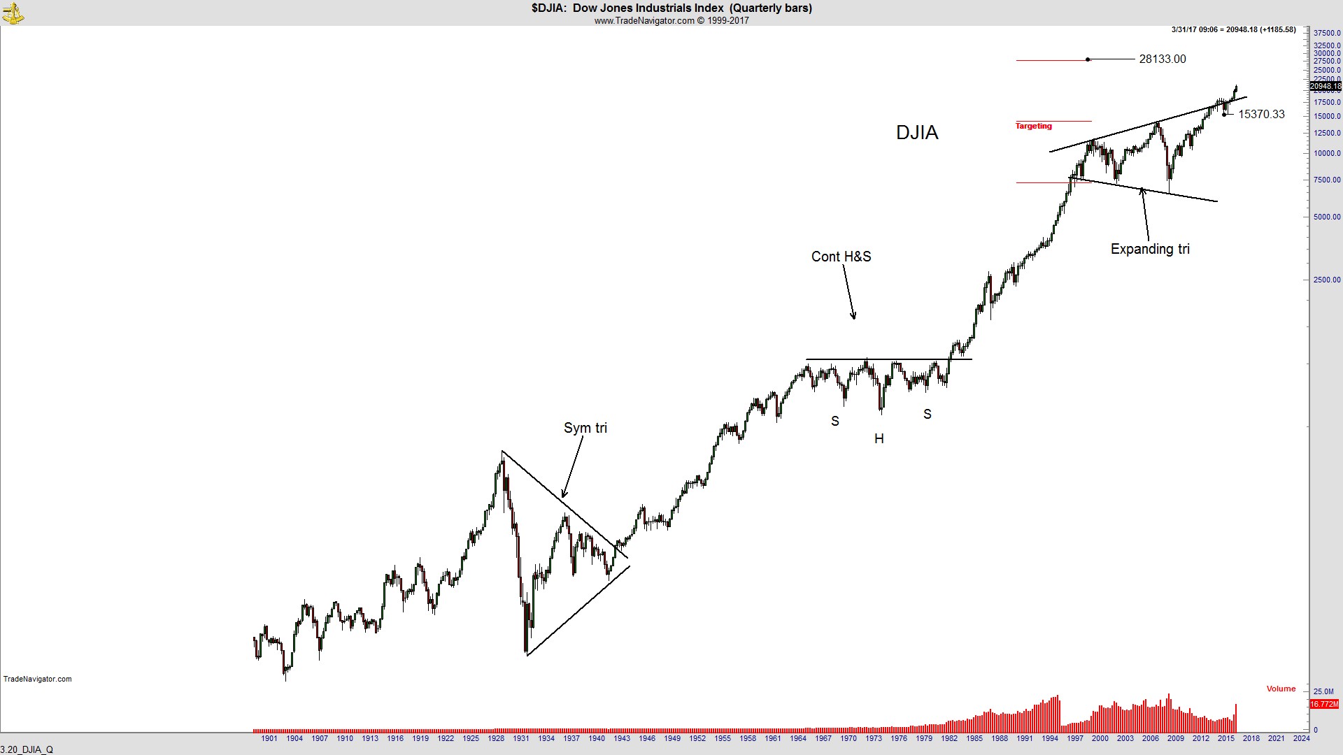
Megaphone patterns are highly unreliable, provide little to no edge greater than a coin flip and because of the nature of their shape (expanding swings between tops and bottoms) are miserable to try and profit from. Someone, somewhere once tagged them the “Jaws of Death” because if prices do breakdown, it’s usually a doozy of a decline. Plus, it wouldn’t sell many fear newsletters (like this writer was trying to do) if you called it something like “Baby Steps Lower” now would it?

Because of the megaphone’s undependability, I don’t use them to help manage risk as I would with other patterns. But that does not mean I ignore their message. I borrowed the Dow Jones Industrials chart below from one of my mentors, one of the greatest traders ever (profits >43% per year for more than 23 years) Peter Brandt.  For those wondering, the reason the DJIA is being used rather than the broader index is because of the desire to show as much history as possible. The DJIA goes back to 1896 while the SP500 index only goes back to 1957. What should jump out at you is the DJIA has broken out ABOVE the current megaphone pattern (Jaws of Life anyone?) and projects to an upside target greater than 28000.

Best San Ramon bay area financial advisor independent fee only CFP - 3-29-17 - DJIA

In spite of the negative fundamentals, political strife and radical changes going on in the world, we need to be open to the possibility that stocks can move substantially higher. That’s the beauty of technical analysis. We don’t focus on the whys but rather just price movement. The whys aren’t fully understood until much, much later and typically after the chance to profit has come and gone. It’s all about making money, not about being right.

Why Fundamentals Don’t Matter (until they do)

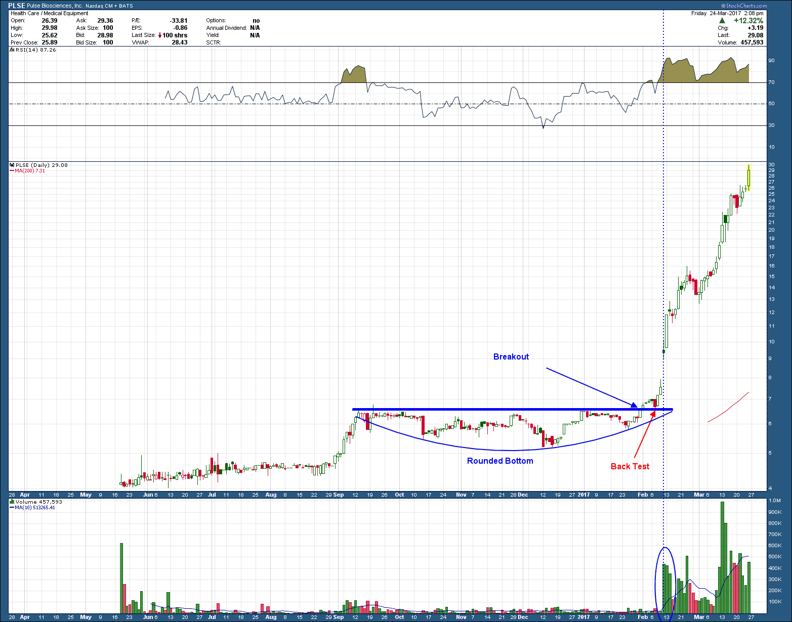
I often get questions about a company’s fundamental analysis. In my experience, fundamentals are of little value on their own. Oh, don’t get me wrong they do matter, but because they are a horrid timing tool, their most value is realized when looking in the rear view mirror. A good example is this year’s best performing stock, PLSE (up a trivial 320%). PLSE has no revenue, no profits and nothing from every other fundamental metric. As such, it would never show up on any fundamental screens that identified strong companies and would likely be missed by investors. That is unless they also (or instead) used technical analysis.

One common element to finding these “runners” is they will almost always start with a long basing period in which the stock price does nothing but chop around and go sideways. This action drives the bulls away and some of the bears eventually give up out of boredom.  The few that remain are the fuel to create a short squeeze driving buying volume higher acting as the impetus for a strong breakout. Like the basing pattern, volume is also clear when looking at a chart.

Taking a look at the PLSE chart below, we can see price chopped around sideways for about 20 weeks forming a rounded bottom. Price broke out from the blue horizontal resistance on light volume, fell back and retested that same line and then catapulted upward, pushed dramatically higher on more than 20 times the prior average volume.

Independent Investment advisor and CFP in San Ramon fee-only - 3-27-17  PLSE

This is a textbook example of accumulation. Prices can only rocket higher when the BIG guys (institutions) step in and buy. The good news for us little guys is that the BIG GUYS leave trails, not unlike when you are tracking elephants. In the case of institutions, we see their trails in volume patterns.

While this topic is one for another post, the opposite is true too in times of distribution. When the BIG GUYS begin to sell their shares, a topping pattern is typically formed and the elephant’s droppings are visible in the form of large selling volume.  Since it has been before Moses parted the Red Sea that we have seen distribution in the stock market, you are just going to have to believe me on this.