Part 3 in this series, this week I wanted to look at market breadth and see what, if anything, it is telling us. Market averages such as the Dow Industrials or S&P500 indices are the most readily available barometers for market conditions. Using charts, it is relatively straight-forward to determine the current trend, and to identify how long this trend has been in place. However, what is even more beneficial is to have an understanding of not only the price trend but the underlying strength of the individual stocks as this will help substantially in determining the likelihood of the trend changing and the relative levels of market risk. Breadth (participation) indicators were developed precisely with this task in mind: to determine the strength of a market trend by looking at its constituent stocks. Since research has shown that the majority of an average stock’s future price move is due to the direction of the overall stock market, the importance of understanding what market breadth cannot be understated.
If all this is putting you to sleep because it’s too technical, a real simple way to think of this is a stock market can only continue to rise if the majority of the stocks that make up that market are rising. The converse is true too when the market is falling. Since this series of blog posts is about analyzing market tops if you apply that understanding logically you would not expect a top to be reached until the majority of the stocks in the market are no longer rising and instead falling. While there are many different ways analysts slice and dice the internal market breadth data I am not going to go into detail here rather state that what is most important is trend of that data not each exact value.
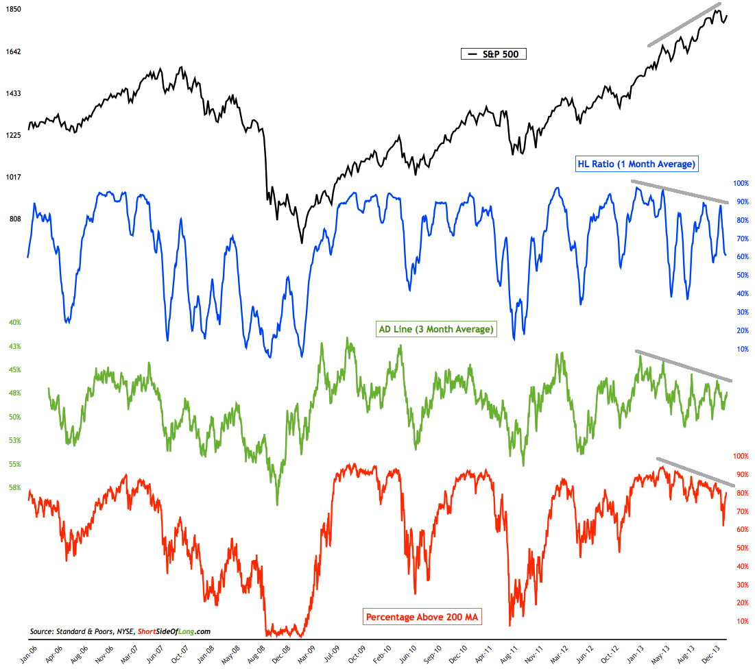
The chart below shows the SP500 US stock index (in black) on the top and three different breadth indicators (in blue, green and red). In order to get a good level of confidence in interpreting market participation, I like to look at a few different breadth measurements in hopes they are all telling the same story. If they are, a yellow flag is raised and tells me more intense and frequent monitoring is required. In the case of the chart below, you can see the trends of all three measurements are declining. You should also notice the SP500 price trend is pointing UP. This is divergence and it is warning of the potential for lower stock prices. Either the trend of breadth continues to decline and the SP500 will eventually follow suit or we will need to see greater participation here in the coming weeks.
An interesting observation you can make about the chart is that during the recent correction over one third of SP500 stocks dropped below their 200 MA. This was the first time breadth readings dropped below 75% since late 2012. This shows just how strong the recent bull market has been. The question is, was this sell off an indication of something bigger to come or was it just another correction in the uptrend?
While this is a warning sign it does not mean to me it is time to get out of the market. This is just one of a many indicators I watch. When the majority of them turn yellow or red and tip the scales convincingly to the side of the bears that becomes my trigger to take evasive action. Until then it doesn’t mean you shouldn’t consider taking some risk off the table due to the increased uncertainty and warning flags that are popping up. But, for now the trend is still up and until it changes it is important to respect it.

