Socio-economic

The Fed Awakens

Now that the dust has finally settled from the Fed raising interest rates last week, some may be wondering what we might be in for based upon historical precedence of rising rates. I’ll start with the reassuring news. First rate hikes have been followed by higher stock prices over the following 12 months. Stocks have risen strongly when a rate-tightening cycle was started in response to economic growth. In the six 12-month periods starting in 1954 with core inflation characterized as low, stocks rose four times. Stocks rose every time when core inflation was low, bond valuations were high and interest rates were first raised.

Before you back up the truck, here is the asterisk. Though seemingly bullish for the current environment, the sample size is small. Plus, the current trio of a first rate hike, low inflation and high bond valuations has only previously occurred in 1954, 1958 and 2004. So while the record is favorable, it’s not a slam dunk. Since at least 1954 (if not further back), the Federal Reserve has never raised rates from such a low level. That's not to mention that large banks are currently being required to meet tougher capital requirements and oil remains in the doldrums, having traded below as $35 per barrel which was last touched at the 2009 bottom.

In 1954, the Korean War had recently ended and the Federal Reserve was just a few years past no longer having to monetize Treasury debt at a fixed rate. In 1972, Bretton Woods had recently ended and the Arab oil embargo ensued not too far afterward. In 1983, Paul Volcker was battling double-digit inflation. In 1998, the tech bubble was quickly enlarging. The point is that there are always events occurring that not only influence the decisions made by the Federal Open Market Committee (FOMC), but also how stocks and bonds perform after the rate hike tightening cycle begins.

What matters going forward is how the U.S. economy performs as well as the magnitude of future rate hikes and more importantly the pace at which they occur. The FOMC thought our economy is finally strong enough to withstand a rate hike, though inflation remains below its target. Globally, economic growth remains weak. China is slowing, while Europe and Japan are stagnant. Commodity-producing countries continue to be adversely affected by weak oil, coal and metal prices. If these conditions continue, it would be easier for the FOMC to justify gradual increases in rates, which Chair Janet Yellen suggested would be the path going forward.

Rising prices are nice, but the magnitude of the price gains is also important. Periods of monetary tightening are associated with small-cap stocks being adversely affected more than large-cap stocks, but both have realized lower, though—and importantly—still positive, returns. The sample size is small and while history often rhymes, the future has a tendency of unfolding in ways we do not expect it to.

Between robust employment gains, rate hikes, falling oil, and a strong dollar, the market cannot decide on a direction. This, combined with the fact we have a flat 200 day moving average leads to choppy markets where every breakout/breakdown fizzles and reverses days later. As I have stated in the past when in this environment it is best to just sit on your hands and wait for the existing trend to reestablish (up) or new trend to commence (down).

Looking at the US SP500 index

All year, the S&P 500 has been trading in a large trading range. More and more areas of the market are breaking down while fewer and fewer remain in good shape The last two months on the S&P 500 have been a microcosm of the entire year – the index has not really gone anywhere, but where ever it has gone it has done so quickly. This market continues to produce the feeling to me that we are experiencing a major topping process. 4 of my 5 indicators have provided a sell signal over the past 6 months and as a result has increased our cash position to the highest point of the year. Although a healthy year-end rally could easily reverse all damage.

As you can see in the chart below, the rounded top that has been developing for the past year has not been invalidated and is still in play. Until price can break above the 2130 prior high in May we are in an intermediate term downtrend. If we break below the 1990 first red horizontal support we are likely to see further downside and retest the 1870 August lows (lower red horizontal). A break and confirmation below that? Well let’s just say that will indicate a new short, intermediate and long term bear market has likely begun.  

bay area financial advisor, pleasanton financial planning for retirement

Stepping back and taking a look from the 50000 ft level, it’s a strange world as we sit only 6% from all-time highs and it feels like the market has caved in around us. With the year winding down and most of Wall St and traders unplugging their computers, market movements over the final two will be viewed with a skeptical eye. 2016 seems to me is setting up to be a doozy as it is unlikely we stay range bound as we have this year.   

US Taxes Returning to Economy-Killing Level

I have written about him many times and posted some of his free work on this blog in the past but this week’s post by Tom McClellan is very enlightening. Tom, one of the fathers of technical analysis, takes on US taxes, US debt, US economy and the US stock market and how they are all interrelated in one fell swoop.  I have copied his insightful look below but I encourage anyone who I wants to stay tuned into the market to check in with him regularly here  

US Taxes Returning to Economy-Killing Level

The April 15 income tax filing deadline came this week, and so taxes are on the minds of a lot of Americans.  As Arthur Laffer noted 3 decades ago, it really is possible to set tax rates too high such that it actually hurts the economy.  We appear to be in such a condition now.

I wrote about this topic back in January, when lawmakers were contemplating raising the tax on gasoline.  But it is worth revisiting as we see total federal receipts creeping up toward 18% of GDP.  Whenever total federal tax receipts have exceeded 18% of GDP, the result has always been a recession for the U.S. economy.  And sometimes we can see that effect from a total federal take at less than 18%. 

The current number is 17.5%, based on total federal receipts for the 12 months from April 2014 through March 2015, and based on projected GDP for Q1 of 2015.  That is very close to the 17.7% reading we saw in 2007, just before the financial market collapse.  It is still some distance away from the all-time high reading of 19.8% seen in early 2001, and because of that some economists argue that we can safely go back to those higher levels and have the same strong economy that we saw in the late 1990s. 

There are two problems with that hypothesis.  The first is that economy of the late 1990s was not as strong as the revisionist historians would like us to believe.  The high taxation then pretty effectively killed the technology boom.  Total stock listings on the Nasdaq actually peaked in late 1996, and were in a genuine free-fall long before the bubble peak of the Nasdaq Composite Index in 2000.  That peak came about because a few large tech stocks were hogging up all of the available liquidity, and crowding out the smaller players, sort of like the biggest hippos taking up the last remaining water hole on the Serengeti during a drought.  Unemployment rates also bottomed out in early 2000 and then started upward.

The second problem with that hypothesis is that we don’t have the same demographic conditions now.  In 1999, the members of the Baby Boom generation (born 1946 to 1964) were between 35 and 53 years old, in the peak of their entrepreneurial years.  They were working hard, building companies, and pushing the economy faster than it would normally go.  Now, they are 51 to 69 years old, and are more interested in playing with their grandchildren than in starting a new company and hiring people.

The children of the Baby Boom generation make up what is known as the “Echo Boom”, which peaked in the birth year of 1990.  Those 1990 babies are now just 24 to 25 years old, and many are just now moving out from their parents’ homes.  So they are not quite at their peak of hard work and entrepreneurialism, and even when they do reach that point, their numbers are just a shadow of their parents’ generation.  So the Echo Boomers cannot absorb the same degree of a repressive tax burden that the Baby Boom generation could. 

This 18% recession phenomenon is not new.  It has worked going all the way back to World War II.  Here is the same comparison for the years 1944 to 1980:

[taxes as percentage of GDP 1944-1980]

[taxes as percentage of GDP 1944-1980]

Federal receipts got all the way up to 19.8% of GDP in late 1945, as Congress was trying to pay for WWII and pay off all of those war bonds.  And in case anyone fondly remembers the strong war-time economy then, we should remember that an economy which requires price-fixing and rationing is not a strong economy.  When people cannot find a place to live because of lumber shortages, and have to grow “Victory Gardens” to have produce, that is not a strong economy.  The effects of that taxation repression finally showed up in stock prices during the late 1940s, and only when taxes dropped back down to a less onerous level did the stock market finally start to rebound again. 

When the federal government takes a smaller portion of GDP as taxes, that leaves more money in the actual economy for real people to spend on what they want, and to spread around employing other people.  Growth is the result.  When the federal government takes too much out, it is like a farmer eating his own seed corn; he does not have as much to plant next year. 

Meanwhile, federal government spending for the latest 12 months equals 20.4% of GDP, almost 3 percentage points higher than receipts.  I keep hoping that someday we will get some leaders who realize that in order to pay off $18 trillion of debt, we have to get the spending number underneath the receipts number, and leave it there for a long time.

And we need to keep the federal receipts number well below 18% if we are to avoid the next recession, and its associated downturn in stock prices.  We may already be too late in that regard. 

Jan. 20, 2014

Obviously this post is meant tongue-in-cheek but there actually are those that watch (and invest accordingly) these things … The Super Bowl Indicator holds that any NFC team winning the Super Bowl is bullish for stocks. It’s worked 80% of the time since the Super Bowl began in 1967.  But if you take a close look at the S.B.I.’s performance, you’ll see the stock market LOVES the 49ers. In fact, win or lose, San Francisco has been in the Super Bowl in four of the five best years for the stock market since the big game between the NFC and AFC champs began in 1967. The Niners’ Super Bowl wins in 1985, 1989 and 1995 were followed by annual gains of 27.7%, 27.0% and 33.5%, respectively, for the Dow industrials. From 1967 to last year, only the Pittsburgh Steelers’ victory in 1975 delivered a bigger advance.

Even in 2013, when San Francisco lost to the Baltimore Ravens, the market boomed.

So S.B.I. believers don’t want just any old NFC team to triumph over the AFC champion in the Super Bowl. Under this thinking, it’s best for your portfolio to have the 49ers beat the Seattle Seahawks in Sunday’s NFC championship — and then win the big game itself on Feb. 2. Of course, the Super Bowl Indicator is a classic example of confusing correlation with cause and effect. MarketWatch’s Mark Hulbert took the whole faulty concept to the woodshed in a column last year. As he blasted “spurious correlations,” Hulbert pointed out that Bangladeshi butter production is an even better “indicator” for stocks. Perhaps the S.B.I. should be renamed the B.S.I.

Of the nine years when the  S.B.I. has failed, four involved Super Bowl appearances by the Denver Broncos — who play the New England Patriots on Sunday in the AFC Championship. So you may want to be wary of the Broncos — and also the Patriots. The best performance in years when the Pats won it all was a 3.1% gain in 2004. The worst was a 16.8% drop in 2002. And the Patriots’ loss in 2008 to the New York Giants was followed by Wall Street’s worst year since the Super Bowl began, a 33.8% slide in the Dow.

Seattle’s only Super Bowl appearance in 2006 was a loss to the Pittsburgh Steelers.  The Dow surged that year.  (Although the Seahawks are in the NFC, the Steelers have their roots in the old NFL, and for the purposes of the indicator are deemed to be an NFC team, meaning the indicator is deemed to have held that year.)

Overall, the prediction business is tough. Just ask all those Wall Street strategists who bet that the falling hemlines in last year’s spring collection indicated a bad year for stocks.

Oct. 14, 2013

As the “negotiations” on the debt ceiling continue in Washington, this week’s post comes from the Pew Research Center where they put together a really nice piece called “5 Facts You Should Know About the National Debt”. With the Republican-led House engaged in a stare-down with Senate Democrats and President Obama over raising the federal debt limit, it seems an opportune time to dig into the actual numbers describing the national debt, the debt limit and interest payments on the nation’s credit line:

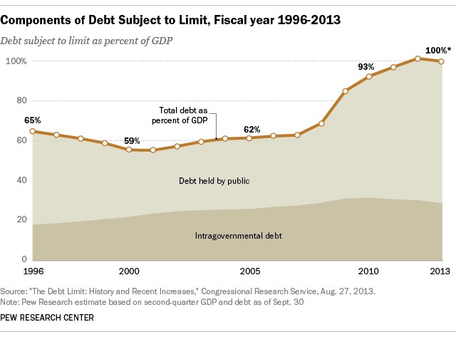
As of Sept. 30 the federal government’s total debt stood at $16.74 trillion, according to the Treasury Department’s monthly reckoning. Nearly all of it is subject to the statutory debt ceiling, which is currently set at a hair under $16.7 trillion; as a result, at the end of September there was just $25 million in unused debt capacity remaining.

The debt is about equal to gross domestic product (GDP), which was $16.661 trillion in the second quarter. (The government’s first read on GDP for the third quarter, which ended Sept. 30, isn’t due till the end of this month, but it likely will be delayed because of the federal shutdown.) Debt as a share of GDP has risen steeply since the 2008 financial crisis: Though U.S. government debt is perhaps the most widely held class of security in the world, as of the end of September 28.4% of the debt (about $4.76 trillion) was owed to another arm of the federal government itself. The single biggest creditor, in fact, are Social Security’s two trust funds, which together held $2.76 trillion in special non-traded Treasury securities (16.5% of the total debt). (Social Security revenues exceeded benefit payments for many years; the surplus was required by law to be invested in Treasuries.) The Federal Reserve banks collectively held nearly $2.1 trillion worth of Treasuries (12.4% of the total debt) as of last week.

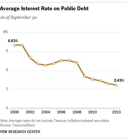
In fiscal 2013, which ended Sept. 30, net interest payments on the debt totaled $222.75 billion, or 6.23% of all federal outlays. (The government paid out an estimated $420.6 billion in interest, but that included interest credited to Social Security and other government trust funds, as well as a relatively small amount of offsetting investment income.) By comparison, debt service was more than 15% of federal outlays in the mid-1990s; the share has fallen partly because lower rates have held down interest payments, but also because outlays have risen substantially: up 39.4% over the past decade. Largely due to the Federal Reserve’s aggressive efforts to keep interest rates low, the U.S. government is paying historically low rates on its debt. In fiscal 2013, according to the Treasury Department, the average interest rate on the public debt was 2.43%. Though you might think such low rates would dissuade investors from buying U.S. government debt, demand has until recently remained strong. But the ongoing debt crisis may be changing that, especially for short-term securities.

BONUS FACT: Though many people may believe that “China owns our debt,” as of July (the latest month available) China’s Treasury holdings amounted to about $1.28 trillion, or 7.6% of the total debt. China is, however, the United States’ largest overseas creditor, ahead of Japan, which holds more than $1.1 trillion in Treasuries