Stocks

Is it Time to Invest in Chinese Stocks?

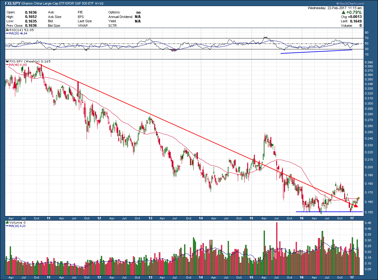
As a part of our process and before we put client money to work, we check to see if the investment in question is rising against both its benchmark and its US counterpart. Chinese stocks have massively underperformed their US counterparts over the past 5 years as you can see in the chart of the ratio of FXI (China ETF) to SPY (SP500) below. In fact, having money in China over the past 5 years has seen that investment lag the US benchmark by nearly 25%.

Fundamentally, Chinese stocks are more attractively priced, present a better value and potentially much greater upside. Because fundamentals don’t matter (until they do) these situations can go on for much longer than make sense. But like all things, this pendulum will eventually swing back in the other direction and the reason we regularly monitor the world for potential shifts in trends.

San Ramon independent fee only investment management expert CFP - 2-22-17 - fxi to SPX

Looking at literally hundreds of charts a week, I am seeing some interesting setups in big cap Chinese stocks such as BABA and BIDU. I wrote about another on Jan 9, WB, which is up more than 30% from the date of that post. You can see in the ratio chart above, it bottomed early last year, testing the .15 level a few times before creating a higher high but eventually falling back to retest that level and failing to start a new uptrend. The good news is the possibility of a reversal is not dead yet. With a divergent momentum low in place as a tailwind, I will be looking for a break above the prior high as my confirmation a bottom and reversal of the downtrend is in place before investment capital is committed to an index of Chinese stocks. Until then, even if we consolidate for many more months and break higher, opportunities in some selective, leading Chinese stocks are looking good and worth an investor’s consideration.

Texas Tea

With the stock market stretched and in need of a pullback, I thought it a good time to look back at what oil is doing since it’s been almost 4 months since we last checked in. As I wrote last October, I expected oil to break higher out of the $50 consolidation range which had developed after forming the double divergent low bottom. It took almost 8 weeks, but it finally broke out to the upside at the end of November (and was confirmed with big volume), peaked its head just above $55 in January and then immediately stalled out. It looks like my $77 dollar upside target will have to wait.

Consolidations that occur immediately after breaking out of a consolidation are nothing out of the ordinary. It is a reflection of a market very much in equilibrium. What makes this most recent consolidation of interest is its tight range ($52-$55) and the fact it has lasted 10 weeks. The greater the time period, combined with the small range, pinches the Bollinger bands and warns that whenever it does breakout it will likely be very a powerful move. Unfortunately, it doesn’t tell us which direction it will go or when. I still give the benefit of the doubt the next move will be higher since that is the direction of the trend prior to consolidation.  

Best Bay area fee only independent financial advisor CFP - 2-20-17 WTIC

Digging a little deeper for some additional ammo to confirm the expectation for oil higher oil prices, we see in the seasonality chart below the fact we are just coming into a time which is normally very bullish for oil.  Over the past 30 years the period from March through October has seen oil’s price rise an average 15%.

San Ramon's best reitrement planning advisor independent fee only CFP - 2-20-17  WTIC seasonality

But what about that nagging fundamental data that shows the world is awash in oil and inventories continue to climb? What about the laws of supply and demand that we learned in econ 101?

 As written in the Financial Times …

 “A mystery is confounding the US oil market: when inventories rise, prices rise, too.  That is not the way it is supposed to work. At 518.1m barrels, stocks of crude sitting in commercial tanks are the highest in records dating to the early 1980s. Fundamentals tell us that excess supply should weigh on markets and drive prices lower. But this year a loose pattern has emerged after the US government releases weekly oil data: surprisingly large increases in crude stocks have prompted spurts of buying.”   

Are we living in the Matrix?

 What’s an investor to do?  First and foremost, recognize that price is all that matters and there are always times when fundamentals, logic and common sense don’t matter. As such Its prudent to use them with caution. Times like this typically occur during fundamental shifts or when irrational exuberance has taken control.  The risk averse approach is to sit on the sidelines and watch. The bolder and riskier style is to recognize that uncertainty can offer a chance to pile up big profits and consider throwing caution to the wind and jump in. If the second option is your style, whatever you do insure you have an exit strategy determined before entering and follow it to a tee. Because when it ends, and it will eventually, it usually leads to an equally nasty move in the other direction.

Listen to Dr. Copper

Scanning as many charts as I do, quite frequently there are “themes” that arise. One that continues to present itself since the Trump win is that of inflation. Interest rates have risen as are commodity prices and their related stocks. When you speak of inflation its always prudent to check in with Dr. Copper. Why? Because it is reputed to have a Ph.D. in economics because of its ability to predict turning points in the global economy. Because of copper's widespread applications in most sectors of the economy - from homes and factories, to electronics and power generation and transmission - demand for copper is often viewed as a reliable leading indicator of economic health. This demand is reflected in the market price of copper. Generally, rising copper prices suggest strong copper demand and hence a growing global economy,

As you can see in the 5-year chart of the price of copper below, price bottomed at the beginning of 2015 and formed a divergent momentum low which warned the extensive multi-year downtrend may be coming to an end. As typically occurs after a bottom, price chopped around for more than a year, trading within a tight 35 cent range and formed a symmetrical triangle. The week before the election it broke out to the upside on slightly higher than average volume. With triangles you always have to be concerned whether the breakout will turn out to be a fake out since they are so unreliable. The answer to that question came the following week (and Trump was elected) as it had its greatest weekly rise over the past 5 years on enormous volume.

Independent fee only San Ramon financial advisor and retirement planning cfp - 2-13-17 copper

Since that breakout and while the bulls caught their breath, price consolidated, successfully back-tested its (red) support/resistance line and appears to have broken out last week.

The chart is staying the short to intermediate term copper prices are likely higher and has the room to move potentially significantly higher if the trend continues.  Those not having futures accounts have limited investments to capitalize on this potential move. There is one ETN (JJC) that attempts to mirror its price but it is fairly illiquid and as with all ETNs has inherent contango issues. A better bet would be to look at the copper miners/producers as they typically do as well as, if not better than, the ETN in tracking its price. Keep in mind though, while prices do move in directional lockstep, they are a leveraged play and move significantly greater (both up and down) on a percentage basis than the base metals price.

Beat It

One of my favorite medical stocks Biotelemetry (BEAT) provides cardiac monitoring systems and cardiac core laboratory services across the US. They went public opening trading just above $17/share in Mar 2008 just before the market melted down. They found a bottom in July of 2012 at $1.85, some 90% below their IPO. Since then the ride has been just as crazy as they have risen almost 1200% since then, riddled with plenty of volatility to test an investor’s staying power.

San Ramon financial advisor and bay areas best CFP investment adviser - 2-8-17 -beat

I have actively been looking for a time to enter as the chart above looks as if it has a lot more upside … eventually. Buying now is not in the cards for me. Even though price has been staying nicely above a rising 200 day moving average, it is butting up against the top of a rising wedge pattern while concurrently creating negative momentum divergence. The school of hard knocks has taught me to avoid “opportunities” that share both of these negative characteristics. As such, I will wait for the pullback I expect to occur out of the wedge. Why? The downside target if the pattern plays out (and potential loss if I enter now) is back down around $13, more than 40% from where it closed today. The upside opportunity, is not worth the downside risk.

If I am wrong? It isn’t the first, nor will it be the last time. Opportunities are like buses though, hang out long enough and you will be able to catch the next one.

January 2016 Charts on the Move Video

It's really clear to me at this time, global investors are strongly favoring stocks and we continue to charge higher across the globe.  Of course. things can and do change in an instant so you need a plan, but until that happens we are in an equity bull market that cannot be ignored.

My latest video making this case is available for viewing at the link below

https://youtu.be/4FXgoOOuTQ4

Are you seeing the same?