Chop, chop, chop. Is the market in transition or setting up for another push higher? The link below will take you to my latest May market recap video.
Have a great week
INVESTMENT EDGE
Chop, chop, chop. Is the market in transition or setting up for another push higher? The link below will take you to my latest May market recap video.
Have a great week
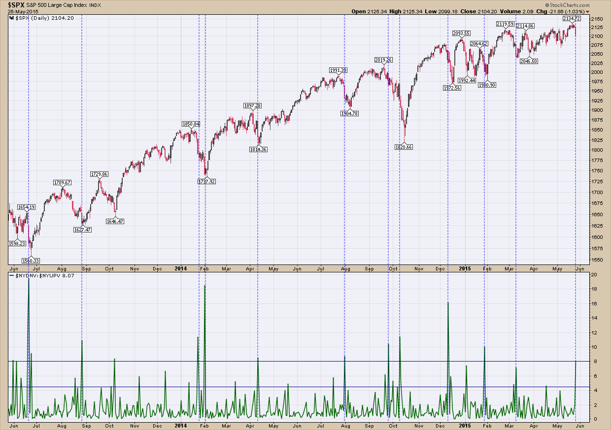
Today was an ugly day in the markets as stocks dropped, volatility gapped 16% higher and bonds had one of their best days in a long time. While there are some very disconcerting fundamentals underneath the hood of the US stock market, to put this day in perspective we are only off 1.3% from all-time highs. But because this is the Jason Bourne market (always an eye on the exit) every time these days occur I check my indicator charts to see if they can give me any insight. One indicator I like to look at first is what I call “volume capitulation” which have presented below. Simply, it tries to identify bottoms during short term corrections by analyzing selling volume. What you see is that at or near the end of a correction everyone that wanted to sell did so (capitulation) and as such the market reasserts back into its uptrend. By looking at volume and selling patterns you can recognize the signs of capitulation. In the upper of pane of the chart is the price of my proxy for the US stock market, the SP500. In the bottom pane is the result of dividing the volume of shares on the NYSE that traded lower by the volume of shares of stocks that traded higher. Logically you would expect on days of capitulatory selling this ratio would be large. In fact that is exactly what happened today as there was more than 8x the down volume as up. What makes this number interesting is that in the past when this ratio has gotten above 8 (I have highlighted these occurrences with blue dashed vertical lines) it has been a pretty good indicator of exhaustion selling and that a bottom was near. While it is not perfect in picking THE bottom (it turns out to be early in most cases), it does provide a nice early warning that a bottom is likely just around the corner. Will this time be any different?

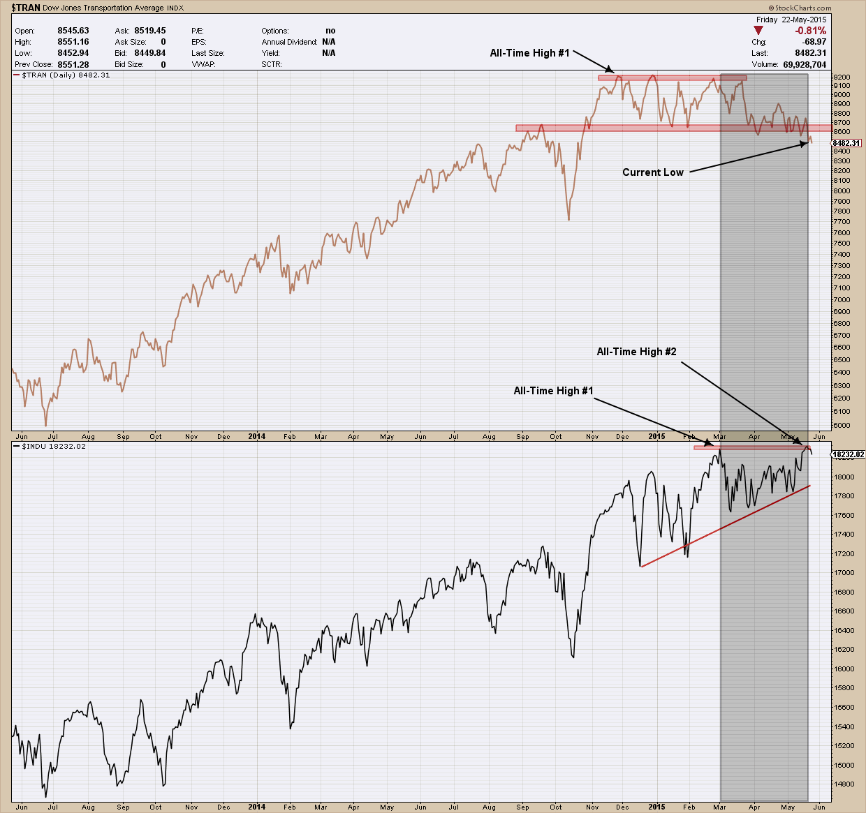
The Dow Theory, developed at the turn of the 20th century by Charles Dow is used by market analysts to determine the long term direction of the stock market. In fact, some use it as a market timing indicator as its performance has been better than a buy and hold strategy over time. Simply put the Dow Theory states that for the markets to be in an uptrend or downtrend, both indexes — Industrials (DJIA) and transports (DJT) — must confirm each other. This means that when one of index make a new high (or falls to a new low), the other should soon follow. If this does not occur you have what is called a non-confirmation. As a side note and in case you are wondering there is no clear definition of what time period “soon” is.
Right now we have the DJIA making all-time new highs and the DJT has not confirmed by making its own new highs. In fact, as you can see in my chart below, the transports (in the upper pane) have been diverging and moving lower since the end of February when the DJIA (lower pane) made a new high. Adding to that, the fact the DJT just recently broke down below an important major level of support (bottom red line) and continues to lose strength is disconcerting.

When a non-confirmation occurs, as we have right now, there are two possible outcomes: the first is the index that has not confirmed will eventually do so and by default, confirm the direction of the trend. The second outcome is the leading index changes course and eventually confirms the lagging index thereby signaling a change in direction/trend. Because the requirements for a proper Dow Theory (buy or sell) signal have not been met, combined with the divergence in the two indexes suggests a more cautionary market stance is appropriate course of action right now.
Fundamentally the case for Chinese stocks is as good as has been in years as not only have they been the best-performing asset class over the past 12 months but the Shanghai Composite is trading well below its record 2007 high leaving it a lot of room higher before finding major resistance. To make the fundamental argument more compelling, China’s nominal GDP has more than doubled since then. Additionally, Chinese GDP relative to world GDP is approximately 14%, while the Chinese market cap relative to world market cap is only 9%. In comparison US GDP relative to world GDP is 27%, while the US market cap relative to world market cap is 37%. Of course, we know the stock market is not the economy but it supports the underlying upside potential. Adding to the fact the number of new Chinese equity trading accounts are surging (adding ~4 million just in March) bringing in a new supply of buyers to their stock market and the promise of monetary stimulus by the Government, the story becomes even more persuasive and as such has my eye.
Fundamentals are good as long-term windsocks, I find when they are used in conjunction with technical analysis the combination provides a great investing mix. The chart below is an 11 year look at the performance ratio of the US total stock market index to that of the Chinese Shanghai index. Starting at the left side of the chart you can see the ratio peaked in 2005 and began to fall eventually finding a bottom in 2008 some 150% lower (meaning the Chinese stock market outperformed the US market during this time period by 150%). The ratio formed a head and shoulders topping pattern in 2006 which provided a downside target (marked by red horizontal line) some 80% lower. The pattern’s target turned out to be incredibly accurate as it eventually bottomed just a few percentage points lower than its objective. Since forming a double bottom in 2009, the roles reversed and US stocks roared back outperforming their Chinese brethren by more than 150% over the next 5 years, topping out in mid-2014 at almost the exact same ratio level as it did in 2005. Like the past top, this one is following the same decline and creating the same head and shoulders topping pattern at the same place and providing the same target. I have to say this chart’s symmetry is a thing of beauty and helps to illustrate that markets do repeat the same patterns over and over. While they don’t all work out this nicely when they do it helps reinforce the value technical analysis brings to the investors toolbox.

I wrote about the breakout in China here back in January some 30+% lower than where we are today. So now what? Is it too late? Based upon the evidence above I expect the Shanghai market to continue its outperformance against the US total market index for another 15-18 months where it will likely reach its projected target. What happens after that is anybody’s guess but what it is telling us is it’s not too late to jump into the Chinese stock market if you are not already exposed. The potential for an upside of 50% against the US markets is just too compelling to ignore.
I wanted to take a look at bonds for this post as we have been in the midst of a nasty intermediate term correction where the 20 year bond has lost 13% over the past 3 months. One needs to look no further than the US dollar for a major source as the correlation between the two is strong.
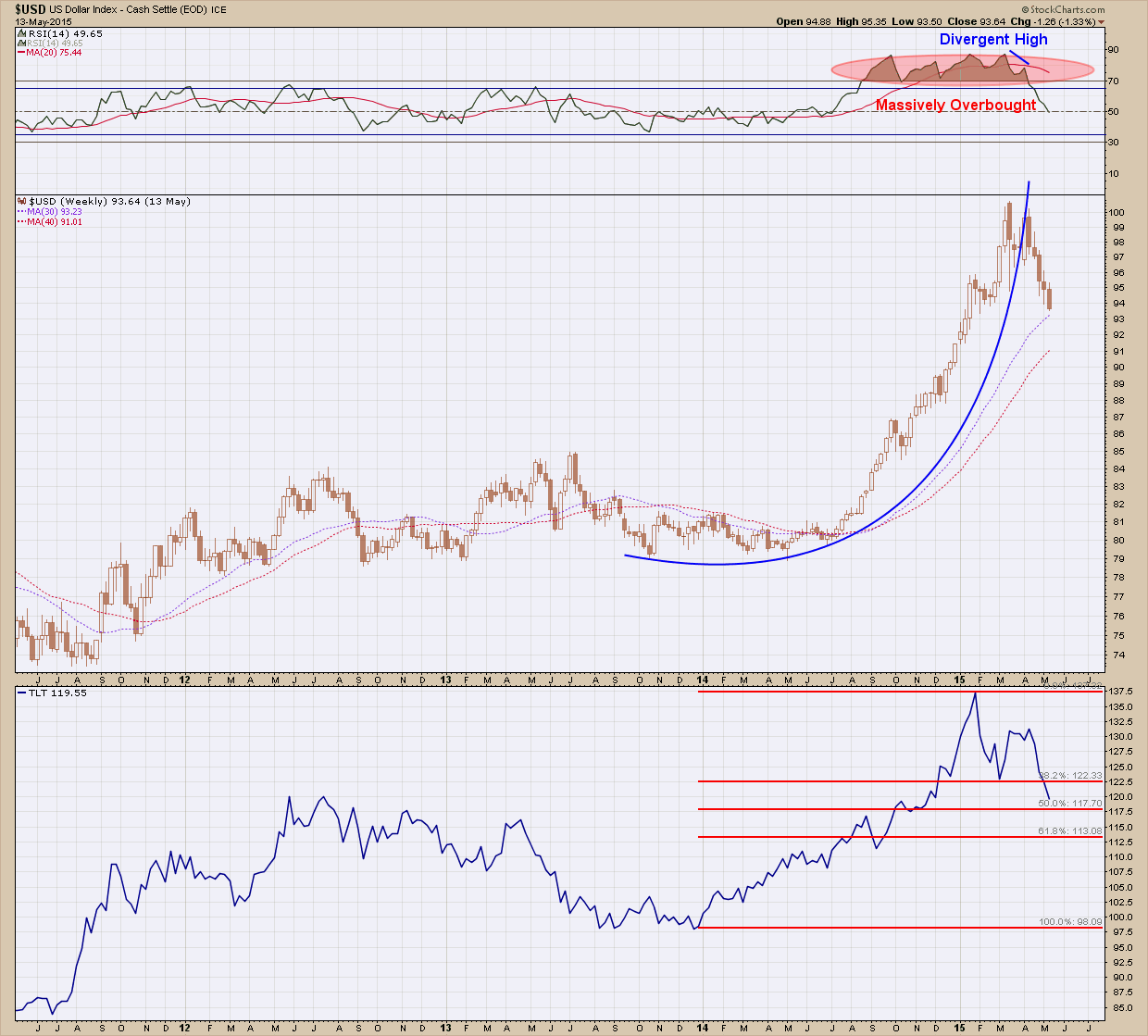
The chart below is split into 3 panes. The upper pane is a measure of US Dollar momentum, the middle is the US Dollar price and the lower is my proxy for bonds, TLT, price of the 20 year treasury. It’s easy to see the bottom of the dollar coincided with a bottom in bonds back in late 2013. The dollar broke out of its consolidation pattern and began a parabolic rise where at the start of 2015 it created a divergent high (price is moving higher while momentum is falling). This, combined with a massively over-bought condition was the warning shot a correction (not a reversal) was forthcoming. As the dollar has fallen, as you can see the affect it has on bonds as they have fallen along with it.

So now what? Is the end for the dollar and therefore bonds? Is it time to panic and follow Sonny’s plan in the Godfather and hit the mattresses? The prognosticators have been proclaiming the end of the dollar for years, is that fateful day finally upon us? Not as far as I am concerned. As with all investments when the price moves too far too fast a consolidation is necessary in order to build up enough strength (find more buyers) in order to move higher. Consolidations can be sideways or downward in their direction and be short lived or uncomfortably long. A good rule of thumb is to expect their duration to be proportional to the strength of the movement in price. Additionally, because of the long base in which the dollar broke out of, its target is expected higher beyond the recent peak and will likely take a long time to complete (years). So, in spite of the negative short term impact to portfolios and the top pickers calling for Armageddon, the long term view is still compelling for the dollar. Whether bonds continue their positive correlation and follow in the dollar’s footstep or not only time will tell but I do think for at least the near future the two will continue to move in lockstep.
Because we have formed positive divergence on the shorter term daily chart and we are approaching the 50% Fibonacci retracement, I expect we see this latest consolidation run its course sooner rather than later. Keep in mind the real tell will be not where or when this correction ends but instead where the reflexive bounce up from here takes us. If it turns out that bounce creates a lower high, that would be my signal to shorten up maturities and follow Sonny’s recommendation to hunker down and lay low. But until then, don’t fight the trend and suck it up as this is likely only a correction, not a top.
Charts are great tools to bring clarity to noisy, volatile markets but we need to respect the fact that in the end they can be overridden by news and manipulation. I hesitate to use the word manipulation because markets, if large enough, should be able to shrug off (long term) manipulation. But I hope everyone understands I am not wearing my tin foil hat because both bonds and currencies are two markets which have well-armed, locked and loaded central banks and Governments around the world intervening daily. That is not conspiracy: it is fact. As such, we always take our investment queue and game plan from the charts but realize things can change very quickly which is why we create an exit strategy for every investment BEFORE entering just in case the market wants to prove us wrong.
At some point, like all bull markets, this bond bull will die too. Its death is not what scares me but instead it will be the fact that I expect most investors will be caught flat-footed. It’s been more than 30 years since this bull market started and very few have a plan for when it ends. Additionally, it is unlikely they have they been investing long enough to have lived through a prior bear and as such will not recognize (or may have forgotten) what one looks like. Most importantly I question whether investors understand the magnitude of the impact to their investment portfolio when rates begin to rise. A general rule of thumb is that for every year of duration in their portfolio, a 1% rise in interest rates will create a proportional loss in their bond holdings. So what that means is if your portfolio has a duration of 20 years and interest rates rise 1%, you will lose ~20% on your bond positions. Are you prepared for this?