Investments

Our Neighbors to the South

Checking in with the Mexican stock market I find a nice opportunity developing.  But probably not in the traditional way you have been trained to think. For trend investors it’s possible to make money in investments that are moving up or down but not sideways.  So, in this post I wanted to take a look at a short trade setup looking to make money as the price of a stock falls. I don’t spend a lot of time addressing these types of opportunities here in the blog because I am not able to short stocks for my clients but that does not mean others reading these posts shouldn’t learn and have the potential to capitalize.  What I am trying to teach is a process, not a specific trade or investment.  Remember ...

“You need to establish a process and stick to that process. You need to know what you’re going to do any given day and for any given investment scenario. Because if you don’t have a plan, when you get punched in the face by the market you’re not going to react well. Process is everything.”

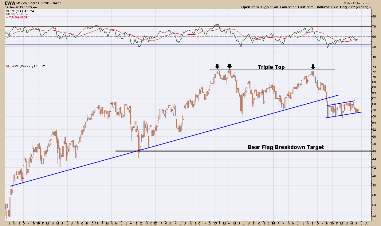
The Mexico stock market ETF, EWW has been in rising uptrend since its bottom in 2009 and has stayed above its (blue) support line until the end of last year. After attempting to break higher three times and failing (creating the triple top), EWW fell almost 18% in the period of 3 weeks and found support at $56. Since then it has consolidated, chopping sideways (within the rising blue channel lines) frustrating the bulls and bears alike. It’s quite common to see consolidation patterns form just under a major breakouts (up or down) and this one is no different. This pattern, on a break below the bottom blue channel, has a projected target at the prior 2011 lows, $46. This works out to just over a 20% fall.

I love 20% opportunities.  There are, of course, no guarantees, but a nimble trader shorting the ETF on a break of below the channel with a stop back inside the channel would get a very attractive ~10:1 risk reward ratio and a chance for a 20% return.  I like those odds.

Bay area certified financial planner investment adviser

The Most Hated

At the end of a client portfolio review last week I ended the discussion with what I expected from the markets for the balance of the year. In summary what I said was based upon today’s current market trend and year end seasonal patterns my intermediate term expectations are bullish but I anticipate we will see a correction, maybe something as large as 10-20% in the short term.  I said this not because I was trying to predict the future but rather set expectation based upon probabilities of the fact it has been well beyond the average period between bear corrections. Like a rubber band the further you stretch it out, the harder it is to stretch it further and eventually it finally snaps.  Without taking a breath my client said “isn’t this what you said last year?”, and I immediately quipped “yes, and the year before that too”.  In all honesty these past few years have been very frustrating but have taught me to 1) accept the fact no one can predict the market’s future direction and 2) make sure you have an investment plan that works no matter what the market gives you. A couple of days after my meeting I read an article where  Ralph Acampora, the “Godfather of Technical Analysis”, was interviewed. Ralph is a pioneer in the development of market analytics and has a global reputation as a market historian and a technical analyst. He is a published author, popular lecturer and a leading international expert, consulted by prominent financial experts and journalists worldwide. He was asked about this current market and told the following story (which made me feel a lot better after reading it) …

I love to tell this story; in fact I have a picture of the man I’m talking about. The year is 1970; the man I’m talking to is Ken Ward. He worked for an old firm called Hayden Stone—you might remember that name.  He was a technical guru in his day.  I’m sitting next to him at this dinner and it’s like I’m sitting next to Joe DiMaggio. I was so excited.  By the way, he was 80 years old in 1970. That means he lived through every bull and bear market in the 20th Century up to that date and wrote about it. So I lean across the table and I say, “Mr. Ward, what was the most difficult market you ever had to experience?”  And then I said, “Oh, forgive me Mr. Ward, that’s a silly question, it has got to be the crash of 1929.” With a gravelly voice the old man says, “No. The most difficult market was the early sixties.”  I said, “But Mr. Ward, it went up.”  He said, “It sure did. We were all looking for a correction and it just kept going, climbing and climbing.” Sound familiar? ...

Here I am, 50 years later and I now understand what the man was talking about. The last year and a half for me has been very, very difficult because I haven’t seen a market like this. This is the most hated market I’ve ever seen and it’s persistent on the upside. I’ll gladly wait for a correction. But what we have in common with the early 1960s is low inflation and low interest rates. That’s the fertile ground that secular bull markets live in. I have a picture of him and me sitting there. I was 29 years old and I show that picture to everybody and I tell that story over and over again.

Crying Wolf

I have written many times in the past about rising wedges and their bearish implications.  In this unbelievably strong bull market prior rising wedges, for the most part have failed to follow through. So, at the risk of crying wolf and giving up providing a potentially important message, I am going to present another rising wedge that has raised its ugly head. If you stop reading here I fully understand based upon past failed examples but the way Murphy’s law works is that one time you don’t pay attention turns out to be the real deal.  So hear me out.

One of the strongest sectors of this 7 year bull market has been the strength of the Nasdaq 100, symbol QQQ. It’s an ETF that holds the top 100 technology stocks. So when this area of the market is telling us a story we should sit up and listen.

Let’s take a look at the daily chart below and see what it is telling us. The upper pane, price momentum, is providing a mixed signal as it is oscillating within the bullish zone but been negatively diverging with price since the start of the rising wedge. The bottom pane, volume,  is telling us distribution is slowly occurring as the selling volume is stronger of late. Indicators and volume are helpful and should be used as confirmation only because in the end the only thing that matters is price which is represented in the middle, largest pane.

Pleasanton investment advisor

Analyzing the price action two important bearish elements should jump out at you. The first being we formed a rising wedge (blue lines) and price finally broke below it today.  Secondly, we formed a double top at $111. Both of these patterns carry bearish implications. I have illustrated the chart with two horizontal red lines which represent very critical areas of support at ~$105 and ~$99.5 should the market want to fall further from here.  Very interestingly and coincidentally the projected move from both of these bearish elements projects the same thing, is a correction to the $99-$100 area, or right at S2. When a confluence of evidence points to the same outcome, that provides additional validity and importance to that outcome.

The inner investor on my left shoulder is telling me that any correction forthcoming is just a consolidation in an ongoing uptrend so no action is necessary. Sit on your hands, be patient and ride the long term trend.. The inner trader on my right shoulder tells me this bull is tired and that if today’s hammer close does not act as a reversal, this is a place to take some profits, take some risk off the table and consider adding a hedge to protect my portfolio.  So the question that needs to be answered is are we traders or investors?

Hanging by a Thread

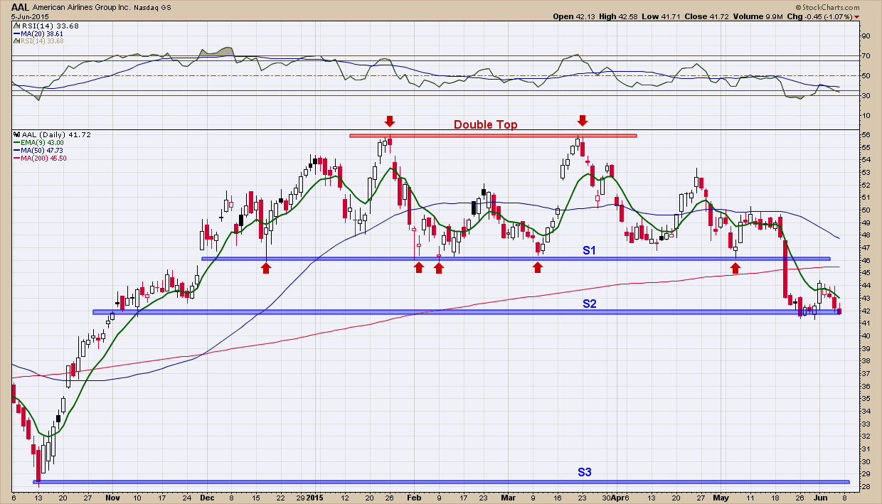
Earlier in the quarter the Dow Theory warning light started flashing as the transportation index began to fall and created divergence with the industrials which continued to rise.  I won’t spend any more time on the Dow Theory as I have beat this concept to death in the past. When a sector begins to breakdown I find it extremely useful to analyze some of the components to see what is “under the hood”. What I wanted to show you in this post is one of the components of the transportation index, American Airlines. I selected it as I couldn’t find a more textbook example of symmetry in price movement and I thought it would be an excellent teaching vehicle. Rarely are topping patterns this pretty and uniform. Presenting a sloppy image that is hard to visualize is a tough sell when trying to teach, trust me so I just couldn’t pass up the opportunity.    

You can see in the daily chart of American Airlines (AAL) below, price created a high in January of this year around $56, which I have marked by the left-most red “down” arrow. After that, price declined and bottomed near $46 (I have drawn a blue horizontal line at that level and labeled it “S1”). After bottoming, price chopped around in a $4 range for a month when the bulls once again took control in March and pushed it back up to the prior $56 high where the bulls ran out of gas creating a double top and major line of resistance. Immediately thereafter price quickly began to move lower, chopped around again and finally bottomed where?  Yup right back at $46. You’ve probably already noticed how that $46 level provided support many times as it was touched at least 4 times (highlighted by my red “up” arrows) and each time it was hit, it bounced higher.  Well that is until the middle of May where that “support” finally gave way and price blew right through proving the old adage that the more times price hits support the greater the probability it will bust through it.

bay area investment adviser  in Pleasanton

Hopefully in trying to follow price action with my explanation it is becoming easier to see how being able to recognize and use lines of support and resistance are valuable tools in investment management toolbox. If you fast forward to where we are today you can see we are sitting right on the next level of support, “S2”. If we continue to test that level and eventually break below “S2” like we did “S1” where do you think the next likely support level would be?  To find that answer you need to look left and see how price acted on the way up. You can quickly see there is really nothing until “S3” which is ~$28. So, if you still owned this investment (and did not sell on the break below “S1” which confirmed the topping pattern was “in effect”) the question you need to ask is if it breaks below “S2” are you willing to hold it in the drop from “S2” to “S3” (an additional 33% loss) as that is a likely target? Or do you cut your loss and move on to another investment that is in a clear uptrend?  Right now anyone owning this is hanging by a thread as the weight of the evidence is in favor of the bears. Hopefully this example helps to illustrate why all investors have an exit strategy in place BEFORE purchasing any investment as eventually every investment is faced with succumbing to bear market losses. Nothing goes up forever.

I can’t end this post without pointing out the beautiful symmetry of the (double) topping pattern that has formed (so far). From the first break above “S1” in December of last year, price formed two “humps” and then topped out at $56. From there it fell back to S1, and then moved almost exactly ½ the way from “S2” to “S1”. That entire move was almost 3 months. Notice how over the next 3 months price did an almost exact backwards retracement of what just happened the prior 3 months before. This is a symmetry at its finest. When symmetry happens it can provide those who recognize it a very powerful edge as it gives a potential road map of future price movement. Armed with symmetry and with a confirmed break below “S2”, the road map it is painting is clear: expect price to follow a reverse course from “S2” to “S3 as it did on its rise from “S3” to “S2” in October of last year and find a bottom.  

Summer Historical Stock Market Seasonality Patterns

Below are the seasonality stats for the S&P 500 during the Summer months:

  • June: Higher 65% of the time in the last 20yrs. Avg % return = 0% (Yes you read that right, 0% is the average return for June)
  • July: Higher 45% of the time in the last 20yrs. Avg % return = +0.4%
  • August: Higher 55% of the time in the last 20yrs. Avg % return = -0.8%

(Seasonality data from equityclock.com)

I find it interesting that the only month with a positive average historical return (July) was the one in which had the lowest probability of having a positive returns.