Investments

February 2018 Charts on the Move Video

February welcomed back volatility and our first double digit decline in many, many months. February also marked the end of the intermediate term parabolic blowoff and points to further consolidation in the coming months as I discuss in my latest video

https://youtu.be/aec4QquCfUk


The Market is Crashing .... or Not

Like everything, its a matter of perspective. Top pickers continue to call for a market top and hunker down in the "safety" of zero return cash or bonds whose value is declining due to rising interest rates.  These are the same people who have accurately predicted 17 of the last 3 corrections. They may eventually be proven right but tops are only known after the fact. It’s important to listen to the market and interpret what it is saying rather than react to human emotions.

I have to ask, is the chart below indicative of a market that is in such a decline that you should bail out of your stock positions? Out of 70 country stock markets analyzed, ZERO are in a bear market (as defined by down 20% or more from their 52 week high). This chart helps to put into perspective today’s global risk appetite which is clearly favoring stocks. This could change at any time but until it does it’s always best to stay with the trend, ignore the noise and avoid bad investment decisions driven by emotions.

san ramon and bay area fiduciary fee only independent financial advisor and retirement planning cfp - 2-28-18.PNG

Is This the Reason for the High Divorce Rate?

This the Reason for the High Divorce Rate?

Do you think, based upon the Economists data below, if the tradition of the man giving his bride-to-be an engagement ring changed to giving stock certificates would materially decrease the divorce rate? At least they would be starting off on better financial footing (said with tongue planted firmly in cheek)

San Ramon east bay area fee only napfa certifiied financial planning independent investment adviaor fiduciary.png

Regeneron – The End of the Bull?

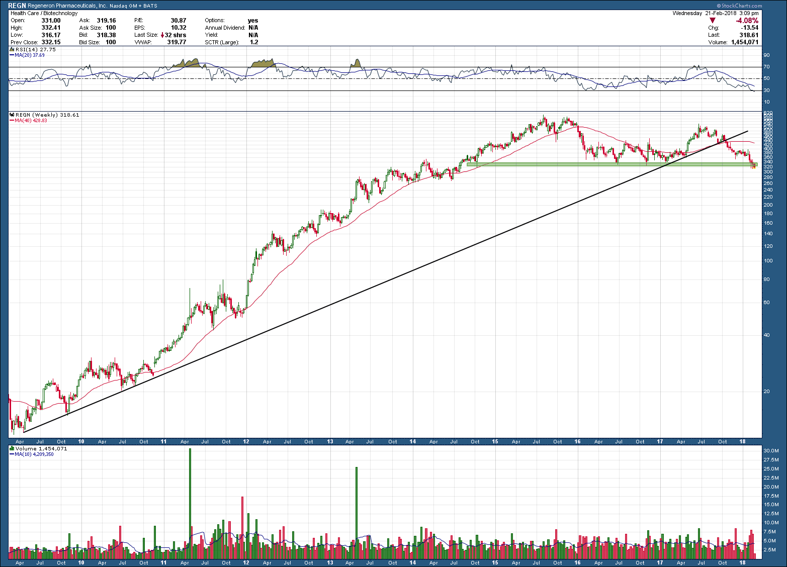
Regeneron, REGN, makes a compelling example of allure of biotech stocks for investors. After breaking out higher in 2009 from a multi-year base, it’s stock went on to post gains of more than 5000% in 5+ years, peaking in August of 2015. Since that time, it has declined almost 50%, something difficult for buy-and-hold investors to experience, unless they got in real early and are still positive on their positions (which only makes it slightly less difficult).

Notice how in 2015 the stock eventually fell below its rising 200 day moving average, bounced off of (green) support and made one more attempt to move higher. That next move higher failed and made a lower high and has now broken below the black uptrend support and once again fallen below (a now falling) 200 day moving average.  Price sits at the bottom of support and a continued probe lower and hold below will likely be the trigger that REGN’s uptrend is done (as in put a fork in it) and to expect much lower future prices. Take note and memorize what has occurred as this is a classic long term topping pattern that most all investments mirror when their bull run eventually ends.     

san ramon certified financial planning investment advisor and fiduciary retiement planner.png

What You Want vs. What You Need

The best way to destroy the capitalist system is to debauch the currency. By a continuing process of inflation governments can confiscate, secretly and unobserved, an important part of the wealth of their citizens.” - John Maynard Keynes

 “Inflation is when you pay fifteen dollars for the ten-dollar haircut you used to get for five dollars when you had hair.” ― Sam Ewing

 ---------------------------------------------------------------

We all understand the destructive effects of inflation has over time but what happens when inflation is as low as it has been over the past 20 years? What you say, inflation has not been low? Your personal experiences says otherwise? Our Government’s Bureau of Labor Statistics (BLS) begs to differ. Prices on average over the past 20 years has been 55.6% which works out to be an annualized rate of ~2.02%. One of the lowest 20 year periods …. Ever. So who’s right?

 The problem as we uncover when peeling back the onion, is how the BLS calculates its numbers. To avoid going down that rat hole into a hornets nest, it’s safe to say that inflation is the sum of the prices of things that are rising and the rest that are rising more. Unfortunately, as it works out, the things that you want are rising while the things you need are the things that are rising more. This has never been so apparent than in the most recent 20-year data presented in the chart below.

san ramon fee only independent retirement planning certified financial planning wealth advisor CFP.png

 One scrutinizing the chart may point out that food and beverage prices (a need) have been rising at an “average” rate. The devil is in the details here too. Looking under the hood you will see the things that are healthier (unprocessed and natural foods) are rising at a much faster rate than things like fast food. Oh and while I do have some millennial readers, no, cellphone service is NOT a thing you need.