Investments

Paid Forward

The graphic below is a high probability snapshot into our stock returns future. The grey line is percentage (left vertical axis) of US households that own stocks. The red line is the subsequent SP500 total return (right hand vertical axis). The correlation between these two over the past 67 years has been very, very strong as you can see. The take away is the more US households that own stocks, the lower the subsequent 10-year return in the US stock SP500 index. This does make sense if you look at it from the context of supply and demand. The more people who already own stocks, the fewer households that are left to buy and drive prices higher. We are at the third highest level in the history of the dataset and at current levels, we can expect a 10 year forward return of a whopping 3%.  Ugh!

san ramon napfa cfp certified retirement investment advisor paid forward - 10-17-18.jpg

What could make this chart wrong? Not much as the correlation is too strong! But, a huge correction always takes care of too much stock ownership. Not a great solution you say? With the financial world continuing to expand globally, there are people from other nations who, in the past would not even be considered potential buyers but because of expanding worldwide wealth, are now added to the pool of potential investors in the SP500.  How much upside might that add, if any, is unknown.

The chart clearly shows that we have not yet reached other levels of extreme participation (and worse subsequent future 10-year returns) and as such we could move even higher. So, while all is not lost, the outlook for equity returns is becoming disappointingly uninspiring. We have pulled forward both demand and returns and by doing so have set ourselves up for a likely lackluster investment future.  I don’t want to be a Debbie Downer but being prepared for the high probability of the next 10 years being not a compelling investment environment should be some knowledge of great value. We either need to reset our expectations or change our investment approach if we want (or need) better returns.

A Few Questions to Ponder

The average country ETF is now down over 10% year-to-date. US large caps continue to mask global equity weakness as you can see in the chart below. Diversified global investors are likely down for the year.

San ramon retirement fee only fiduciary financial advisor.jpeg

If the take-away from this chart is a snapshot of investors global appetite for risk, what are the numbers telling you? Risk on or risk off? Do you think there is a higher probability to turn 41 countries into positive returns or 4 countries negative? With that in mind and in spite of the US holding on to year-to-date positive equity returns, this chart should be telling a tale of caution, at least for investors outside the US.

Un Investment Idea

While the dollar has been acting as a governor for the price of most commodities, there are a few exceptions which are doing quite well thank you …. most notably, oil. Another that has caught my eye is Uranium. Since it has limited uses, highly regulated but reasonably low demand (unless you are North Korea) at 70-80 metric tons per year, it should come as no surprise the market is very thin and can fly under the radar of most investors.

One of the largest publicly traded Uranium companies is Cameco, CCJ. Based in Saskatoon Canada, CCJ is licensed to produce up to 26 tons annually. Unfortunately, the market for Uranium from 2014 through 2017 was a tough one as the price of CCJ fell almost 70% during that period. Since 2014 though, as you can see in the chart below, the character of the stock has changed, setting up for a potential directional change.  It has gone from one in a downtrend to one that has made a higher high and higher low from its oversold low. Notice also, the inverse head and shoulders bottoming pattern whose neckline is now being tested from underneath. An argument for the validity of a new trend change can be seen in the amount of shares being traded (bottom volume pane), as it has been more than 2x the average while forming the right shoulder of the large, almost two-year pattern.

San Ramon  retirement certified financial planner &napfa investment advisor - ccj 10-10-18.png

A break and hold above the neckline points to a target at ~$18 above, a 50% potential gain.  50% gain opportunities don’t come along too often and when they do they should pique an investors attention. This one has mine. For those who find this setup compelling, keep in addition to the normal single stock risk this one comes with additional baggage.  When you combine that with the fact nuclear power and weapons can, for many investors can elicit a “third rail” type of reaction and it is on the cusp of not meeting liquidity requirements, Financial Perspectives clients are unlikely to find this in their portfolios regardless of the upside potential any time soon. But those investors who invest only to make money and without regard to morals or personal beliefs, this is one for your consideration.

Bonds Away

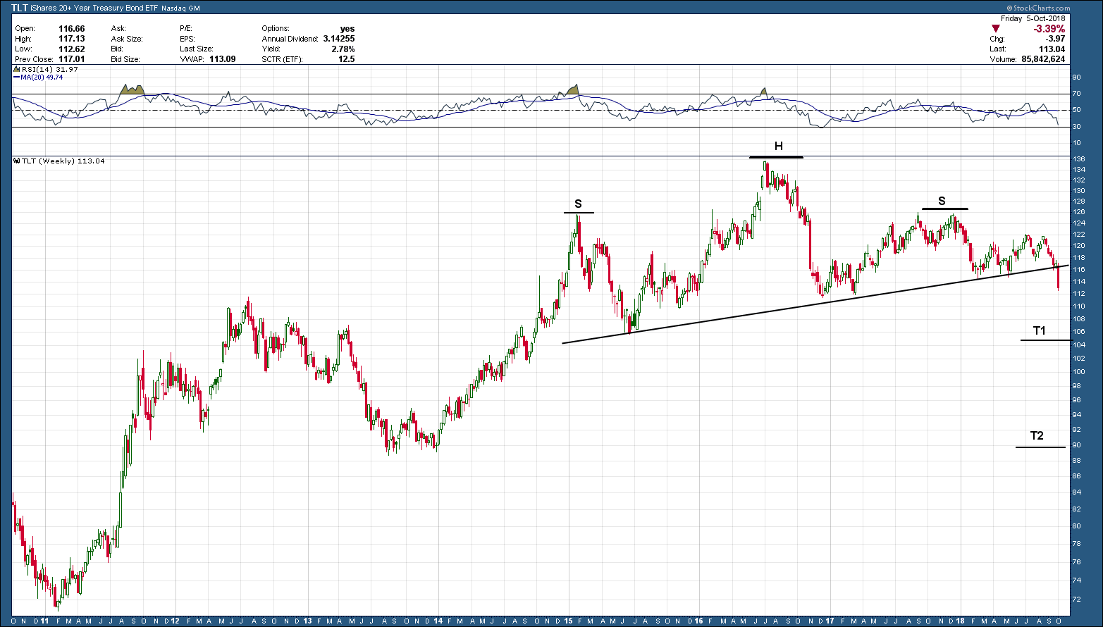
The most important development of the week (and maybe the year) took place in the bond markets. As such, it should come as no surprise that last week’s volatility in stocks was directly related to what was happening to bonds. As we see below in the chart of the 20-year bond ETF, TLT, it started the week right on the neckline (support) of the multi-year head and shoulders topping pattern. As the week progressed, the sell-off in bonds gained steam and eventually closed out firmly below support. Investors under 40 years of age, and possibly even 50 or older (depending upon when they started investing) have never experienced a declining bond market. So, for most a potential bond bear market is uncharted territory.

san ramon napfa fee only financial advisor CFP.png

As you know by now, all patterns are not relevant or meaningful until they have a confirmed close. A confirmed close we have but we need to see the neckline hold as resistance in the coming trading sessions. If so, the 20-year bond has a tough row ahead as the first target is down at T1, and the second is back at 2013’s lows, some 20% below where we started the week.

The table below shows an example of what bond holders across different types of bonds could expect with only a 1% rise in rates and why this potential breakdown is such a big deal. Not every rising rate period is exactly the same so your mileage may vary. What stays constant regardless of the period is the fact the longer the maturity, the greater the expected decline.

bay area napfa fee only financial advisor CFP.png

September 2018 Charts on the Move Video

The bulls were out in force as we closed out the third quarter. With the expected year end rally, 2018 looks to be another strong year for the market…. the US stock market. Bonds, commodities and foreign investments continue to under-perform and act as an anchor to portfolios. Mean reversion will eventually show up but, based upon the charts, Q42018 seems like more of the same.

My Q3 recap video can be viewed in the link below.

https://youtu.be/MgUbcV8Ckb8