Miscellaneous

Nov. 18, 2013

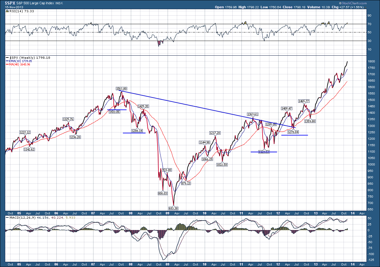
A good market technician will ignore all the fundamental arguments of why an investment should go up or down and focus solely on price. The basis for this is that all “fundamentals” should be built into the price of an investment.  In today’s world where information is available, almost instantaneously in fact, this reasoning has a sound foundation. I have been preaching fundamentals for years and have found out while they do matter in the long run, the short term on-the-other-hand can provide a completely different outcome. Starting with no bias or fundamental beliefs, thus weekend I took a long term look at two US stock indexes, SP500 and the Nasdaq and the results surprised me.

Below is the SP500 index sporting a very nice looking slanted inverse head and shoulders pattern which has a projected target of 2111, which is an increase of 19% from last Friday’s closing price
The NASDAQ has the exact same setup but a projected target of 4433 which is 11% higher from here.
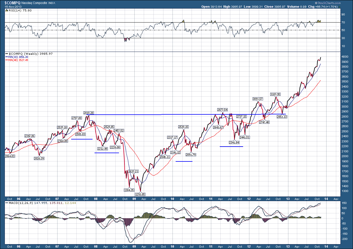
While I am by no means predicting the future, I wanted to take an objective look at “possibilities” for the chance for further upside and if it existed, how much further.  What I discovered is the market has much more upside than I thought possible, so I need to adjust my views accordingly. By no means if we push higher and hit my targets or even go beyond do I believe it will be a straight moon shot there. I would expect to see the normal ebbs and flows of prices with the possibility of a short term correction (10% or less) between now and then.  In spite of the gamut of negative fundamental arguments (most of which I have addressed before), price says we have more upside.

Oct. 28, 2013

For the second straight year, millions of Social Security recipients, disabled veterans and federal retirees can expect historically small increases in their benefits come January.  Preliminary figures suggest a benefit increase of roughly 1.5 percent, which would be among the smallest since automatic increases were adopted in 1975, according to an analysis by The Associated Press.  Next year's raise will be small because consumer prices, as measured by the government, haven't gone up much in the past year. The exact size of the cost-of-living adjustment, or COLA, won't be known until the Labor Department releases the inflation report for September. That was supposed to happen earlier this month, but the report was delayed because of the government shutdown. The COLA is usually announced in October to give Social Security and other benefit programs time to adjust January payments. The Social Security Administration has given no indication that raises would be delayed because of the shutdown, but advocates for seniors said the uncertainty was unwelcome.

More than one-fifth of the country is waiting for the news.  Nearly 58 million retirees, disabled workers, spouses and children get Social Security benefits. The average monthly payment is $1,162. A 1.5 percent raise would increase the typical monthly payment by about $17.

The COLA also affects benefits for more than 3 million disabled veterans, about 2.5 million federal retirees and their survivors, and more than 8 million people who get Supplemental Security Income, the disability program for the poor. Automatic COLAs were adopted so that benefits for people on fixed incomes would keep up with rising prices. Many seniors, however, complain that the COLA sometimes falls short, leaving them little wiggle room.

Since 1975, annual Social Security raises have averaged 4.1 percent. Only six times have they been less than 2 percent, including this year, when the increase was 1.7 percent. There was no COLA in 2010 or 2011 because inflation was too low. The COLA is calculated by comparing consumer prices in July, August and September each year to prices in the same three months from the previous year. If prices go up over the course of the year, benefits go up, starting with payments delivered in January.

Advocates for seniors say the government's measure of inflation doesn't accurately reflect price increases older Americans face because they tend to spend more of their income on health care. Medical costs went up less than in previous years but still outpaced other consumer prices.

Oct. 21, 2013

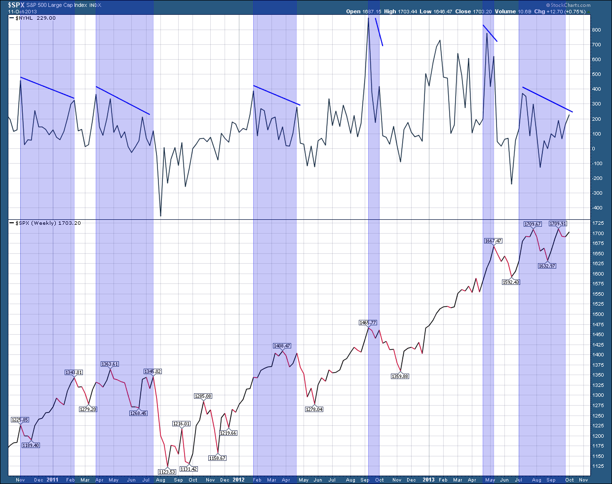
As a part of our regular market analysis we continuously watch the internals to look for structural changes that may provide warning a change may be afoot.  Two of the “internals” we follow are the advance decline line and the number of stocks reaching all-time highs. The AD line measures the number of stocks that are advancing (going up) against those that are declining (going down).  It makes sense that over time the AD line must either rise or at least stay flat if the stock market (SP500) is going rise. A basket of stocks like the SP500 index can only continue to rise if the majority of the underlying stocks that make up the index are going higher.

In the chart below, the upper pane is the AD line while the lower pane shows the price movement of the SP500 (US Stocks) index over the past 15 years.  I have highlighted, in blue, areas where the AD line declined but the SP500 (US stocks) rose.  As you know by now, this is called divergence and when divergence raises its ugly head, it warns a change may be ahead. As you can see, we are in a period where divergence has formed --- prices are rising and the AD line declining. So why does this matter and why do I watch this so closely?  With further analysis you can see that every time this has occurred in the past, stocks declined.  Not immediately but they declined.  So this gets the hair on the back of my neck standing up and I need to look deeper for further confirmation.

Now let’s go to the second chart which shows the number of stocks that are reaching all-time highs in price (new highs) which are plotted in the upper pane. In the bottom pane I have, once again plotted the SP500 index price as my proxy for the US stock market.  This is not too different from the first chart because over time the “new highs” line must either rise or at least stay flat if the stock market is going rise. The stock market index can’t continue to rise over time if the number of “new highs” decline. Higher prices in the individual stocks are required for the index to make higher prices.  As with the first chart I have highlighted, in blue, areas where the “new highs” line declines but the SP500 (US stocks) rise.  As with the first chart, you can see it does a very good job at giving advance warning that a correction could be near.

While these “internals” are not perfect at predicting the future, they are very good at giving us an advance warning of potential struggles ahead. Unfortunately, while they do raise a warning flag they don’t give insight as to when it will occur or how big a correction to expect.  In as much as we already experienced a mild correction over the prior 2 weeks to the debt ceiling debate, the question that comes to mind is it whether that correction is the extent of it or do we have more to come?  While I have been burned before in being too bearish on my concerns of a top, I am cautiously optimistic we are near an end of this correction and the two cyclical, seasonal bullish trends will provide the support the market needs to move ahead through the balance of the year and pushing the potential for a much greater decline into the first half of next year.

Sept. 30, 2013

There's a world-famous value manager who stopped buying stocks in 2007 and started to hoard more and more cash. He was not predicting the Financial Crisis or the Credit Crash that would lead to a 60% drop for the S&P over the next two years. He simply couldn't find enough stocks to buy that fit his value parameters. That discipline helped him (and his clients) avoid much of the carnage that followed in 2008. The worst thing I could say about the current moment in the US stock market is that as value managers, like in 2007, we are struggling to find cheap stocks. The S&P 500 currently sells for a high market multiple historically and an even richer multiple considering what the growth picture currently looks like.

In the meantime, many value managers are increasingly hoarding cash - either because they can't find compelling values or because they foresee better opportunities ahead.

According to Bloomberg, it seems to be a trend:

The $1.1 billion Weitz Value and $980 million Weitz Partners Value funds each have cash stakes that are close to 30 percent. At the $10.6 billion Yacktman Focused fund, cash has crept up from 14 percent a year ago to 19 percent. The $1.3 billion Westwood Income Opportunity has about 16 percent in cash, more than double what it had at the start of the year. Cash makes up about 28 percent of assets in the $8.9 billion IVA Worldwide Fund, up from 10 percent a year ago, and is 33 percent of the $508 million GoodHaven fund, up from 19 percent a year ago.

There’s no big macroeconomic prediction fueling the move of these value managers into cash; just employing the simple investing discipline of rebalancing. The Leuthold Group reports that the median price-earnings ratio for large-cap value stocks is 13 percent to 25 percent above its long-term historic norm; large-cap growth stocks trade at an 8 percent to 10 percent discount to their historic norm.

Warren Buffett, according to the latest SEC filings of Berkshire Hathaway, he has raised and is sitting on, $49 billion in cash And in a recent interview he said, “Stocks have moved a long way. They were very cheap five years ago. That’s been corrected...We’re having a hard time finding things to buy.”

There are many differences between now and late 2007 before the crisis - but the current state of valuation is as clear as a bell. We're not cheap here and would benefit greatly from either a real correction in stock prices or a revenue growth spurt to justify current valuations.

Which is it going to be?

Sept. 16, 2013

Some quick background on the familiar Dow Jones Industrial Average (DJIA)- It is a stock market index, and one of several indices created by Wall Street Journal editor and Dow Jones & Company co-founder Charles Dow. The industrial average was first calculated on May 26, 1896. The averages are named after Dow and one of his business associates, statistician Edward Jones. It is an index that shows how 30 large publicly owned companies based in the United States have traded during a standard trading session in the stock market. It is the second oldest U.S. market index after the Dow Jones Transportation Average, which was also created by Dow.

The Industrial portion of the name is largely historical, as many of the modern 30 components have little or nothing to do with traditional heavy industry. The average is price-weighted, and to compensate for the effects of stock splits and other adjustments, it is currently a scaled average. The value of the Dow is not the actual average of the prices of its component stocks, but rather the sum of the component prices divided by a divisor, which changes whenever one of the component stocks has a stock split or stock dividend, so as to generate a consistent value for the index.

With that as a backdrop, it’s interesting to note there will soon be a major shakeup to the Index.  Goldman Sachs Group Inc., Visa Inc. and Nike Inc. will be added after the close of trading on Friday, Sept. 20. The companies replace Bank of America Corp., Hewlett-Packard Co. and Alcoa Inc., with the changes effective at the opening of trading on Monday, Sept. 23.

It marks the first “three for three” change to the index since Apr. 8, 2004. The last change to the index was the addition of Travelers Cos. Inc. and Cisco Systems Inc. on June 8, 2009.

The index changes were prompted by the low stock price of the three companies slated for removal and the Index Committee’s desire to diversify the sector and industry group representation of the index.

If anyone else is scratching their heads on why the DJIA can be at all-time historical highs yet virtually every company that started in the index is no longer in business, it is easily explained with the reshuffling and “gerrymandering” of the index by regularly replacing the worst performers with much stronger companies.

.