Trends

Another Chance?

My April 5th blog post highlighted the compelling investment opportunity that was setting up in the Portuguese stock market using the proxy PGAL. At the time of writing price was at prior resistance, just under the red horizontal line, R1 in the chart below. As you can see, after a brief post blog report consolidation, price jumped strongly through resistance on substantial volume and climbed higher to the next logical resistance zone, R2. Like what occurred when PGAL approached R1, hitting R2 caused it to repel backward and consolidate.

The consolidation allowed the bulls to reload and make another attempt at breaking through R2. With volume patterns mirroring the ideal combined with the shallowness of the pullback, the probability is we see PGAL bust right on through resistance and eventually tag the first target, T1 above. A gain of 30% from my April post.  If the momentum continues in earnest, T1 won’t be difficult to attain and T2 would be next on the radar and maybe (be careful as my cold medications may be effecting my objectivity J) even a retest of prior highs at $16.5.

For those that took the original signal, congratulations. Hang on as it looks like there is a lot more in store. For those that missed out, a confirmed breakout above R2 offers another compelling (not quite as compelling as R1 was obviously) profit opportunity. As always, before any investment opportunity is taken, a position management plan need be created and adhered to. The good news is that breakouts are as easy as they come. A break back below the original breakout level provides an ideal “get the heck out of dodge” sell signal.  Good luck! 

Bay area independent investment advisor san ramon fee only certified financial retirement planner CFP - 7-24-17 - PGAL

The Dollar Down Under

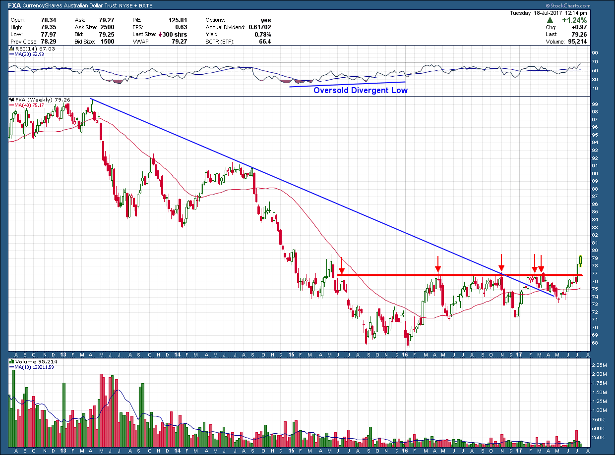
The Australian dollar, like other currencies has had a tough of it over the past few years. After peaking in April 2013 it declined more than 30% in value, bottoming in January of last year. That bottom, like most major declines, formed a divergent momentum low marking a high probability interim low was established. Since that point it attempted (and failed) 4 times to get over the $77 threshold.

San Ramon indpendent investment advisor certified financial planning retirement specialist CFP wealth manager - 7-19-17 -FXA

Not until last week did it have enough oomph to break that level as it did so with a huge move. In addition, price broke above the blue, long-term downtrend line and sits above a rising 200 day moving average. These are all things we want to see when trying to pick a bottom. The upside target for this breakout is up at the $86-$87 level. Since that is mid- congestion, it could get extended, if it wants to run all the way up to $92.  From a management standpoint breakouts are as simple as they come.  Sell on a break below support which provides greater than a 4-1 reward for every dollar you risk.

An Invitation to China's Breakout Party

After more than a 45% decline China’s ETF, FXI, found a bottom early last year and has been moving higher ever since. Earlier in May of this year it retested October 2015’s prior high (~$40.5) and failed.  This should come as no surprise because prior resistance will continue to act as resistance until it is broken through in which case it becomes support.

Unlike what happened in Oct 2015, the bulls this time had enough in the tank to push strongly through resistance last week. Notice how this time price is above the (red) 200 day moving average which is now rising rather than falling. While not spectacular, volume was almost 20% higher than its average which helps confirm last week’s break out is likely the real deal and worth consideration in your portfolio.

After breakouts, investors want to see a follow through the next week preferably with a big white candle like the one that printed last week and on continued large volume. But the market does not always give us what we want so we need to be prepared for a pullback and retest of the prior $40.5 resistance line (which now should act as support). If that occurs and price holds, those that missed this breakout buy would be provided what I would consider a nice second chance on what looks to be an excellent opportunity.  The (ascending triangle) pattern upside target, if the market wants to go higher, is back near the 2015 prior high around $52 a 30% rise from the breakout level.

San ramon independent investment advisor certifed financial planner, CFP NAPFA fee only - 7-17-17 -china

A Look at Real Estate

I received a request (thanks, Cheri) to give my view of the (securitized) Real Estate market. While I include it as a part of my weekly sector analysis top down look at the markets, I typically look to other areas for investment of risk capital. It’s not because I dislike it or have a bias but rather because almost all my clients live in California and have more than their fair share of real estate holdings when considering their homes. As such, adding more real estate into their portfolios (even though it may be a bit different --- commercial REITs vs residential) I don’t feel comfortable over-weighting a portfolio unless everything is perfectly aligned.  We are risk managers first and foremost.

Below is a 5 year chart of IYR (with no dividends reinvested so we can get an idea of movement of price appreciation). In the middle pane, the green bars are the weekly price movement of IYR. Over the past 5 years, the price, without dividends, is up around 20%. In the lower pane is the ratio of IYR to the SP500 stock index. Because the ratio is falling that tells us that real estate (using IYR as a proxy) has under-performed the broader market stock index, SP500.  It may be hard to tell from the chart, but the amount of under-performance has been more than 20% over this 5 year look-back.  And to insure I am comparing apples to apples I have it set up such that this ratio DOES take into account dividends for both holdings.

Bay area wealth manager and certified financial planner CFP retirement advisor - 7-12-17 - iyr

Finally, you will see behind the green bars (IYR price) in the middle pane I have included another plot of the 10 year bond yield with a purple dashed line. You can see the almost perfect inverse correlation that exists between bond yields and real estate. The relationship tells us that as interest rates rise the price of IYR falls.  And vice versa. Intuitively, hopefully this inverse relationship makes sense.

With the potential for higher interest rates in our future a real probability, if that were to occur one would expect real estate to struggle. When combined with real estate’s ongoing struggle against other risk assets options (ie. non-real estate global stocks) and my client’s existing exposure, I still find no compelling reason to commit risk investment capital to this part of the market. If and when the economy slows down and interest rates begin to reverse course or the FED changes direction, I will be more than happy to change my mind but until then, there are much better opportunities available for your investment dollar.

Wheat "ease"

See how easy that was? Back on 6-19 I wrote about how the wheat chart was looking constructive and ripe for a reversal.  Seasonality be damned as the wheat speculators have been out in force driving the price up to my target and even higher, more than 20% in two short weeks.

Fee only certified fianancial retirement planner CFP investment advisor in bay area city of san ramon

Is this sustainable? Not likely but it doesn’t mean it’s done as the markets can stay irrational longer than you can imagine. I would love to see this pullback, create a higher low as it would then allow those that missed out another opportunity to enter as it looks like it wants to run for a while. Congratulations to those that took the trade but it’s time to heed one of our sacred investing rules of not letting a profit turn into a loss so consider taking profits and/or tightening up stops.