Yield

The Dollar Down Under

The Australian dollar, like other currencies has had a tough of it over the past few years. After peaking in April 2013 it declined more than 30% in value, bottoming in January of last year. That bottom, like most major declines, formed a divergent momentum low marking a high probability interim low was established. Since that point it attempted (and failed) 4 times to get over the $77 threshold.

San Ramon indpendent investment advisor certified financial planning retirement specialist CFP wealth manager - 7-19-17 -FXA

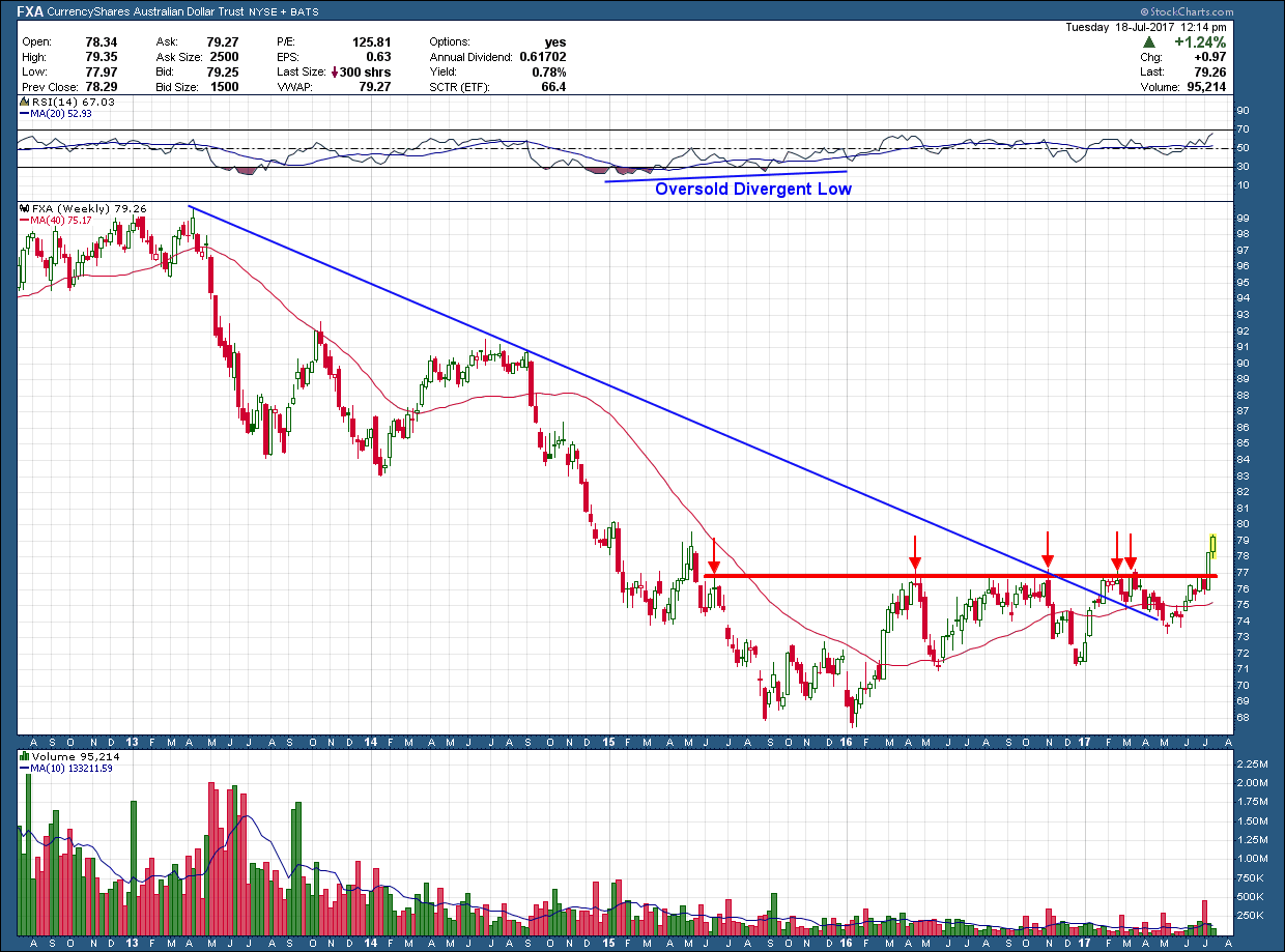
Not until last week did it have enough oomph to break that level as it did so with a huge move. In addition, price broke above the blue, long-term downtrend line and sits above a rising 200 day moving average. These are all things we want to see when trying to pick a bottom. The upside target for this breakout is up at the $86-$87 level. Since that is mid- congestion, it could get extended, if it wants to run all the way up to $92.  From a management standpoint breakouts are as simple as they come.  Sell on a break below support which provides greater than a 4-1 reward for every dollar you risk.

A Look at Real Estate

I received a request (thanks, Cheri) to give my view of the (securitized) Real Estate market. While I include it as a part of my weekly sector analysis top down look at the markets, I typically look to other areas for investment of risk capital. It’s not because I dislike it or have a bias but rather because almost all my clients live in California and have more than their fair share of real estate holdings when considering their homes. As such, adding more real estate into their portfolios (even though it may be a bit different --- commercial REITs vs residential) I don’t feel comfortable over-weighting a portfolio unless everything is perfectly aligned.  We are risk managers first and foremost.

Below is a 5 year chart of IYR (with no dividends reinvested so we can get an idea of movement of price appreciation). In the middle pane, the green bars are the weekly price movement of IYR. Over the past 5 years, the price, without dividends, is up around 20%. In the lower pane is the ratio of IYR to the SP500 stock index. Because the ratio is falling that tells us that real estate (using IYR as a proxy) has under-performed the broader market stock index, SP500.  It may be hard to tell from the chart, but the amount of under-performance has been more than 20% over this 5 year look-back.  And to insure I am comparing apples to apples I have it set up such that this ratio DOES take into account dividends for both holdings.

Bay area wealth manager and certified financial planner CFP retirement advisor - 7-12-17 - iyr

Finally, you will see behind the green bars (IYR price) in the middle pane I have included another plot of the 10 year bond yield with a purple dashed line. You can see the almost perfect inverse correlation that exists between bond yields and real estate. The relationship tells us that as interest rates rise the price of IYR falls.  And vice versa. Intuitively, hopefully this inverse relationship makes sense.

With the potential for higher interest rates in our future a real probability, if that were to occur one would expect real estate to struggle. When combined with real estate’s ongoing struggle against other risk assets options (ie. non-real estate global stocks) and my client’s existing exposure, I still find no compelling reason to commit risk investment capital to this part of the market. If and when the economy slows down and interest rates begin to reverse course or the FED changes direction, I will be more than happy to change my mind but until then, there are much better opportunities available for your investment dollar.

Will JP Morgan Lead Banking Stocks Lower?

The chart of JPM below mirrors that of the banking sector ETF, XLF. A tremendous rally off of the Trump election, enough to create a very overbought condition closing out 2016.  Since that point, it attempted to rally after a small pullback and actually reached new yearly highs in March.  But on that push, negative momentum was formed and the stock has been grinding lower ever since. As you can see JPM has gone nowhere (dead money) for the past 6 months and has formed a bearish head and shoulders reversal pattern.  If the pattern were to play out its target is labeled T1 on the chart some 12% below todays close. T2 is a support level of significance if T1 does not stick and the market continues to sells off.

San ramon independent cfp fee only investment advisor fiduciary - 5-31-17 -JPM

As investors in any region of the world, we always want to see banking stocks in healthy up-trends, making higher highs. While JPM’s price is still above a rising 200 day moving average, it formed a new intermediate term lower high and lower low warning of a potential trend reversal. Any play out of the bearish head and shoulders pattern would make huge dent in the bullish case for banking stocks. 

As goes JPM, so goes the banking sector.

It’s important to know that head and shoulders patterns which are over-hyped up by the financial media’s lack of understanding of technical analysis and constant need for headlines. When these patterns do actually play out they are a thing of beauty and can be quite profitable for those short. But the fact is these pattern either don’t materialize or fail the majority of the time. Why? its because historically stocks have spent 70-80% of the time either moving sideways or higher and this pattern is a marker for stocks moving down. Back to JPM, from a purely mathematical standpoint we have higher statistical probabilities a decline will NOT materialize. Nevertheless whenever these patterns develop they should not be ignored as they are a warning sign and we need to be concerned just in case it turns out to be one of those 20-30% possibilities.

A Retest or Bear Trap?

The 10 year Treasury bond yield found a bottom last July and rose almost 100% in 5 short months. Since topping and forming negative momentum divergence in mid-December, the yield chopped around in a sideways consolidation until mid-April where the 2.34% critical support eventually level failed. 

As we know, frequently when price (in this case yield) breaks below a critical support level, it will often back-test that same level immediately after the break. If that back-test holds, it will typically give the bulls a chance to exit their positions and then see the bears take complete control pushing it lower. Of course, nothing is that easy otherwise we would all be gazillionaires. In addition, there are times when the back-test slices right through the support line like it wasn’t there and climbs higher. This is a classic “bear trap” as investors who shorted at the breakdown are now holding a losing trade (“trapped short”).

Bay area independent fee only cfp financial adivsor retirement expert

As you can see, yields are currently back-testing the underside of critical support as it sits within a cats whisker of it. I pointed out the break down in a past blog post and called an “all clear” to get back into bonds expecting the market to normalize rates lower. We are within a week or less before we find out whether the market is going to prove me wrong and trap yield bear or reverse course and restart the fall in rates (or increase in bond prices since they move inversely)