Regeneron – The End of the Bull?

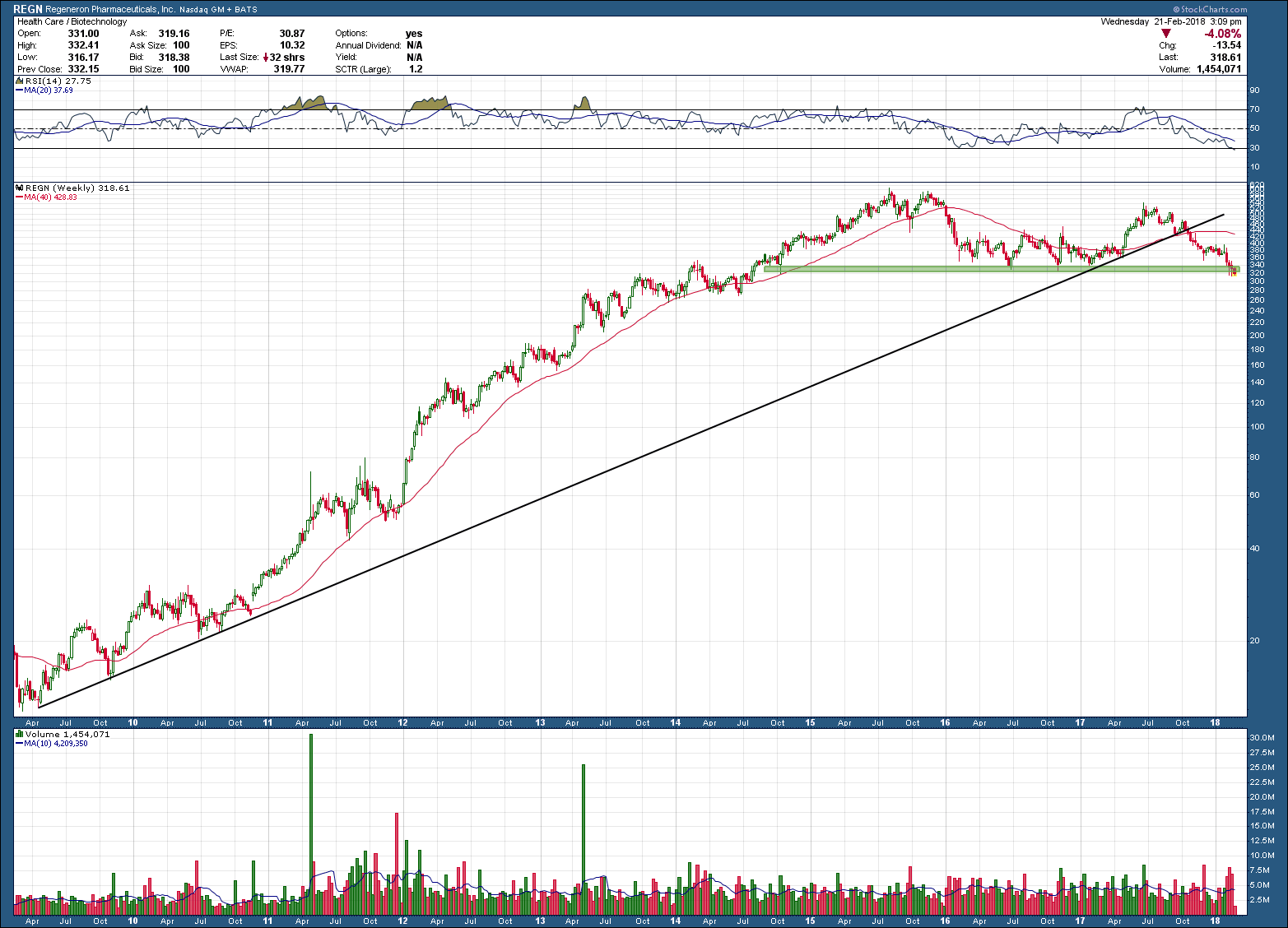
Regeneron, REGN, makes a compelling example of allure of biotech stocks for investors. After breaking out higher in 2009 from a multi-year base, it’s stock went on to post gains of more than 5000% in 5+ years, peaking in August of 2015. Since that time, it has declined almost 50%, something difficult for buy-and-hold investors to experience, unless they got in real early and are still positive on their positions (which only makes it slightly less difficult).

Notice how in 2015 the stock eventually fell below its rising 200 day moving average, bounced off of (green) support and made one more attempt to move higher. That next move higher failed and made a lower high and has now broken below the black uptrend support and once again fallen below (a now falling) 200 day moving average.  Price sits at the bottom of support and a continued probe lower and hold below will likely be the trigger that REGN’s uptrend is done (as in put a fork in it) and to expect much lower future prices. Take note and memorize what has occurred as this is a classic long term topping pattern that most all investments mirror when their bull run eventually ends.     

san ramon certified financial planning investment advisor and fiduciary retiement planner.png

What You Want vs. What You Need

The best way to destroy the capitalist system is to debauch the currency. By a continuing process of inflation governments can confiscate, secretly and unobserved, an important part of the wealth of their citizens.” - John Maynard Keynes

 “Inflation is when you pay fifteen dollars for the ten-dollar haircut you used to get for five dollars when you had hair.” ― Sam Ewing

 ---------------------------------------------------------------

We all understand the destructive effects of inflation has over time but what happens when inflation is as low as it has been over the past 20 years? What you say, inflation has not been low? Your personal experiences says otherwise? Our Government’s Bureau of Labor Statistics (BLS) begs to differ. Prices on average over the past 20 years has been 55.6% which works out to be an annualized rate of ~2.02%. One of the lowest 20 year periods …. Ever. So who’s right?

 The problem as we uncover when peeling back the onion, is how the BLS calculates its numbers. To avoid going down that rat hole into a hornets nest, it’s safe to say that inflation is the sum of the prices of things that are rising and the rest that are rising more. Unfortunately, as it works out, the things that you want are rising while the things you need are the things that are rising more. This has never been so apparent than in the most recent 20-year data presented in the chart below.

san ramon fee only independent retirement planning certified financial planning wealth advisor CFP.png

 One scrutinizing the chart may point out that food and beverage prices (a need) have been rising at an “average” rate. The devil is in the details here too. Looking under the hood you will see the things that are healthier (unprocessed and natural foods) are rising at a much faster rate than things like fast food. Oh and while I do have some millennial readers, no, cellphone service is NOT a thing you need.

“Teck”nical Analysis

The chart of Teck Resources, TECK, is a great example of how one of the basic principles of technical analysis, support and resistance, works.  As you can see in TECK’s daily chart below, price attempted to break above the $25.5-$25.8 zone 4 times before it eventually broke out to the upside in December of last year. While it is referred to as resistance, it is really just referring to the fact that there is an abundance of shares available at the price that investors want to unload. Before prices can work higher, those shares need to be absorbed and be less than current demand.  The basics of TA are based upon simple supply and demand levels (like almost all markets).

San ramon fiduciary fee only retirement planning investment advisor - Teck - 2-14-18.png

Once price moves above the line it changes from resistance to support. Support is just another term used when speaking of demand. Notice how on the chart above price eventually broke above the resistance/support line, peaked, reversed course downward and then found support (demand) right at that same level where they originally broke out? This should not be a surprise as it is something that occurs regularly and why paying attention to these zones is critical. It is another great example of a back test of support. It also provides those that missed buying the original breakout another opportunity to get into the position. More importantly, investors in TECK now have an easy way to manage risk. If the stock fall should at a later date below this original resistance/support line, it would be your signal to exit the position. Not only does it make managing the position easier as it provides a framework and set of rules, it insures any loss because you are wrong, will be very small.

The fact TECK formed an inverse head and shoulders reversal pattern, has broken out and held above support suggests that if it plays out, the upside target is around $37, some 40% from the breakout level. With momentum in the bullish zone and price above a rising 200 day moving average, I find TECK a compelling investment opportunity. My only hesitation, a fundamental one that I must ignore, is if the upside target is to be met, oil prices will need to rise substantially from today’s levels. While this may occur, my read on the current oil market is that over-supply should be the problem for the near and foreseeable future.  As such, until demand picks up, prices should be well contained and may contain the rise in TECK.

Big Change In Bull-Bear Spread

In challenging times when trying to interpret the market's message I love to check in with respected analysts whose opinion and body of work I value, as you know, Tom McClellan is always near the top of my list. His Friday's post on investor sentiment when at extremes was interesting, and worthy of a repost.

February 09, 2018

San Ramon fee only independent financial advisor and retirement planning.CFP 2-12-18 -1. gif


The latest data from Investors Intelligence showed a huge change this week.  Bulls dropped from 66% to 54.4%, and bears rose from 12.6% to 15.5%.  That means the spread between bulls and bears dropped by 14.5 percentage points, which is the biggest one-week drop since July 2011.  Drops of more than 6 percentage points usually mark washout bottoms for prices. 

That July 2011 drop in the bull-bear came as prices crashed down 19%, following the sudden cutoff of QE2.  And there was a similar 14.5 percentage point drop in May 2010, the week of the Flash Crash which occurred after the sudden end of QE1.  The Fed learned from its mistakes, and it wound down QE3 much more slowly.

But all of that extra money was left within the banking system, and investors got used to the plentiful liquidity and low volatility that the excess liquidity brought.  So now, when the Fed is starting to drain the bathtub, the smallest little drop in the Fed’s balance sheet has brought an outsized drop in stock prices, and a corresponding sudden drop in analyst bullishness.

San Ramon fee only independent financial advisor and retirement planning.CFP 2-12-18 -2..gif

The $10 billion per month in reduction of Federal Reserve holdings of T-Bonds and mortgage backed securities (MBS) which was in effect in Q4 of 2017 has now accelerated to a target of $20 billion a month for Q1 of 2018.  But they did the month’s allotted drop all in one week at the end of January, setting up the illiquidity situation that the stock market is going through now. 

The Investors Intelligence sentiment data is very sensitive to price movements.  So it is natural that a big drop like what we have seen would bring a big drop in the bull-bear spread.

San Ramon fee only independent financial advisor and retirement planning.CFP 2-12-18 -3. gif

The change from the prior week takes the bull-bear spread down from above the upper 50-1 Bollinger Band to below the lower one.  It is still not a “low” spread reading, meaning that the value is not as low as what we have seen at important price lows over the past 2 years.  But it is a drop well below the lower band, which is where price lows are found.  And the big one-week change suggests that the down move we have seen in stock prices is exhaustive, meriting a rebound

Does Diversification Matter?

When markets are rising diversification can help investors from putting too much money in the wrong places. On the flip side, performance will always be just average and those who are able, can outperform.

But, unfortunately when it matters most, as markets decline in earnest, diversification fails. The chart below shows how correlated an in lock step the global markets are when in a steep decline. If you are looking for the solution to manage portfolio risk, diversification does little at the times it is needed most. As such, you better have a plan.

bay area certified financial planning fiduciary fee only investment advisor 2-7-18.png