I Hope I am Wrong

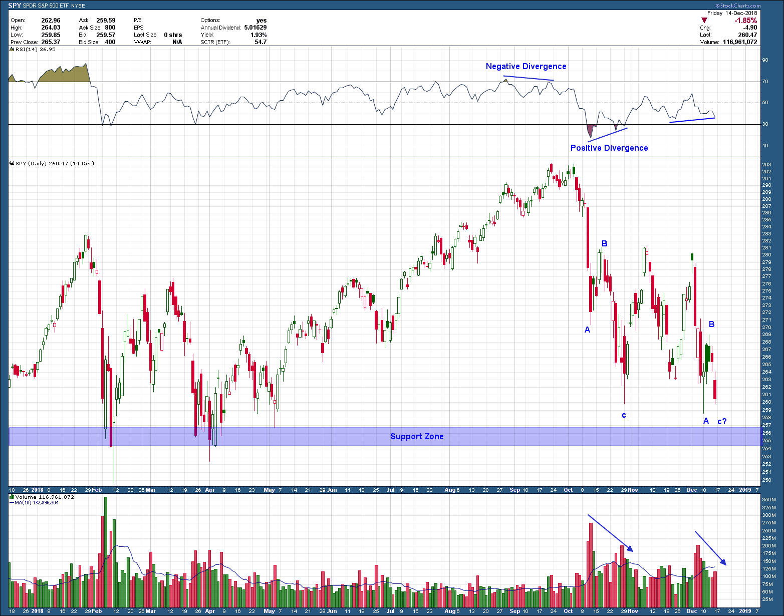
I am sure you don’t need my confirmation to know the markets have a bug up their rear.  Since peaking in October, the SP500 has declined almost 12% peak to trough and sits just above the February lows. That low should act as support if prices want to probe lower.  Notice how the initial breakdown from the Oct high was a 3 wave (a-b-c) decline on falling volume? Also, how the current push down is set up to be exactly the same? We just don’t know where wave c will end on this push. If symmetry is any gauge, a logical target for c to complete is around the “support zone”.

bay area fee only napfa financial adivsor , CFP - SPX -12-17-18.png

Because the market moves in waves (its internal structure), we know a reflexive bounce is likely due soon (this coming week?). Short term traders will take this opportunity to add risk while longer term investors will need to see where this next bounce higher ends. A failure to break above the initial b wave high, would be the time to consider exiting all stock positions by selling into strength. A move higher would target October’s (and all-time) highs as the next logical area for a move higher to stall.

Most large downward moves are in response to either news or poor investor sentiment, or both. Which is why, I am going to stand behind my 10-21-18 video of why I believe October’s highs will turn out to be the end of this almost 10-year bull market.  I hope I am wrong.

Looking Over the Ledge … For a Clue

Keeping with being their role as a canary in the proverbial coal mine, US small cap stocks continue to lead the broader market both into and out of corrections. This includes the most recent correction that started in the August-September timeframe. As you can see in their weekly chart below, the price of the small cap stock index, IWM, sits right on critical support. A breakdown below the $142-$143 level suggests another 17% decline is in the cards based upon a confirmed head and shoulders pattern target, T1.

san ramon napfa cfp financial advisor planning fiduciary 12-12-18.png

Another possible outcome we need to consider is that the current level will actually hold support, move higher on to new highs and remain in a bull market uptrend.

Between the above two possible outcome, I think we will see lower prices in our short to intermediate term future (new lows). But the market doesnt care what I think. There is a version of the breakdown that I am actually favoring at this time. The right shoulder of the pattern is unsymmetrical and a bit malformed (stunted in its time of development) as compared to the left. This can occur in strong downward trending markets but it is not a ideal. As such, I could see the market chop around here a bit more before it resumes its move lower. This would allow the right shoulder to further develop before the breakdown and flush lower occurs. Either way this goes, it is currently at an interesting level. Either way this goes, it is currently at an interesting level and one that shouold interest both bulls and bears alike.

The Art of Knife Catching

Was talking to a great friend the other day and they asked if they should buy bitcoin. I said before you do let’s play a game. I will get on the roof, with you on the ground and I will throw some knives to you. Depending upon how many you catch will determine how much you buy. She laughed and got my point. I have nothing against bitcoin, in fact almost any vehicle is on the table as an investment but any purchase comes with a major condition, only buy if its price is rising. Let’s take a look at the bitcoin chart to see why I don’t believe now is the time to be acquiring this cryptocurrency.

NAPFA fee only investment advisor san ramon and bay area 12-10-18 - bitcoin.png

Long-term readers should easily recognize the ominous parabolic arc pattern. Parabolic Arc chart patterns are generated when steep rise in prices are caused by irrational buying and intense speculation. Parabolic Arcs are fairly rare but they are reliable that when they finally end, the result will be a steep and swift decline. The pattern typically terminates its uptrend and reverses direction upon a price break below the arc. If you are lucky enough to get in early, they are a way to immense riches … or devastation if you don’t have an investment plan (buy and hold)

As you can see after bitcoin broke the arc, it continued to fall, making lower highs and in the process forming a descending triangle pattern. These are typically continuation patterns, meaning there is a higher probability the break of the pattern will be in the direction of the prior trend (lower).  In this case, the break of the pattern that occurred 4 weeks ago points to a target in the area of $2900.  If that doesn’t hold, look out below as support doesn’t really show up until you get to $1000.

Because this is a logarithmic chart, it hides the magnitude of the decline. Put into perspective since peaking in December of last year, bitcoin has lost more than 80% of its value. Unfortunately for the millennials, they are the latest to be schooled by the markets and their early retirement dreams put on hold. It happens to everyone at some point which is being able to recognize irrational human behavior (parabolic arcs), confirmed by repeating patterns, helps to keep knowledgeable investors out of big trouble.

At some point BC will find a bottom and will be something worthy of your investment consideration. Until then, be happy you weren’t a part of the delusional crowd falling for the “hype” and “story” as they always precede parabolic arcs.   

Circling Back Around

In my September 5th blog post after posing the question whether the DJ Internet index formed an intermediate term top, I stated I would circle back around to find the answer to the question. At the time the almost ideal head and shoulders topping pattern had developed and, if played out, pointed to a 12% (or more) decline in the index. I also stated “The two possibilities are 1) a completion move down to T1 or below; or 2) a failure confirmed by a move back above early August’s right shoulder high (before it has completed a move to T1)”.  Here is how the chart of the index looked at the time of the post.

san ramon fee only investment advisor bay areas best napfa financial planning CFP.png

Fast forward to the present and here is how the chart looks as of yesterday’s close.

san ramon fee only investment advisor napfa certified financial planner CFP.png

With the benefit of the recent US Stock market weakness, the answer to my question was a resounding yes as the index met and eventually exceeded the pattern’s target, falling 20% peak to trough as measured from the pattern’s neckline. This is NOT a testament to the power of technical analysis being a predictive tool. It is not. What it is though, is a very good risk management tool. At the time of the post an investor in the index, armed with the knowledge of the possibility of a 12% or more decline in their investment, needed to ask themselves if they wanted to accept that risk. If so, welcome to investing, you just experienced a 20% drawdown. Now what? If not and you exited, congratulations, you have a bigger pile of cash to invest when the next opportunity arises. Not if it arises, but when

November 2018 Charts on the Move Video

As we wind down 2018 (where did it go?) with global stock markets struggling, I am beginning to wonder whether the normal positive seasonality tailwinds will show up and bring investors some year-end joy. Regardless, the markets have been sending some real clear messages on how best to invest. Were you listening?  My take can be viewed in November’s Charts on the Move video link below  

https://youtu.be/suT2WmaOr9A